Tinder for Hosts & Organizers
Abstract
Experience: Mobile
Type: Feature Integration - Meetup
User Persona: David Wallace
Objective: A Tinder-like feature where David can find his next Venue for his music event.
Overview
Summary
A Tinder-like feature where David can find his next Venue for his music event.
Opportunity
Meetup would like to provide a first-class means to increase the ability of Organizers and Hosts to find one another and find a space for their meetups through its mobile app.
Understanding Meetup
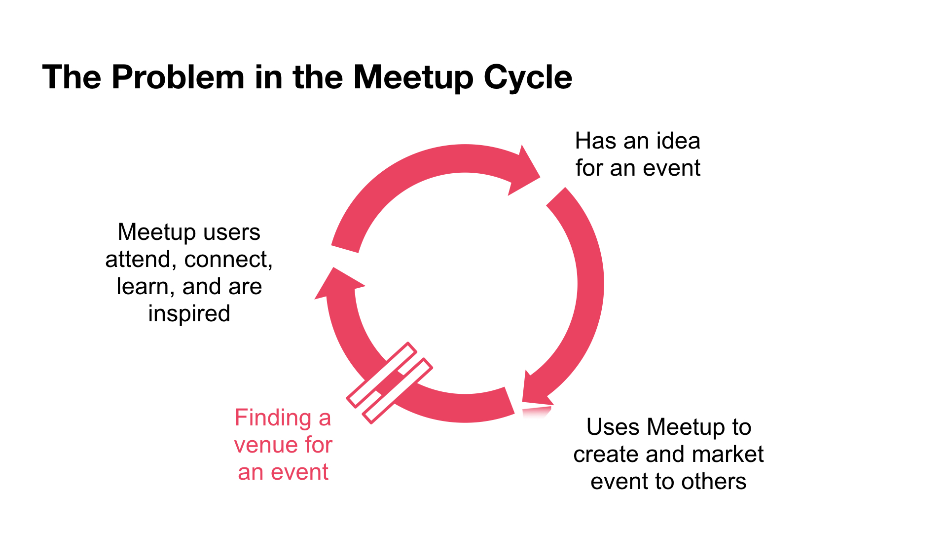
The Problem in the Meetup Cycle
Meetup’s revenue source comes from event organizers posting their events on Meetup. Some of these organizers charge attendees to recoup these costs.
Organizers, after creating their Meetup, must look outside of Meetup’s app experience to find venues to host their events.
This process usually entails getting inspired, researching, booking and working out logistics with the event spaces. It seems unusual to have such an inconvenient process for those supporting the platform.
Our Goal
How do we ensure that Meetup’s users can continue to create and attend events, while increasing Meetup’s revenue?

Project Brief
Duration: 2 weeks
Deliverables: Research Report, Usability Report, Presentation Deck
Team: Sean Ward, Caitlin Aylward, Azhar Bahrainwala
Role(s): UX Researcher, UX/UI Designer, Project Manager
Methods: Context & Problem Space Research, User Research (Screener & Interviews), User Persona & Journey, Competitive Comparative Research, Contextual Inquiry, Design Studio, User Flow, MoSCoW Feature Prioritization, Wireframes, Rapid Prototyping, Usability Testing & Synthesis
Tools: Google Docs, Sketch, InVision, Keynote, Pen & Paper
Research
Narrowing the Scope…
Screener Survey
- 43 responses
- 58% of which organized or helped organize an event
- 19 people left phone numbers which led to 7 user interviews
- Identified themselves as organizers but ranged from professionals to those doing it as an extra curricular activity
Sample Screener Questions
- Have you organized a public event in the last year?
- How many events hosted in the last year?
- How much did you spend on your event spaces?
- How many people attended your last event?
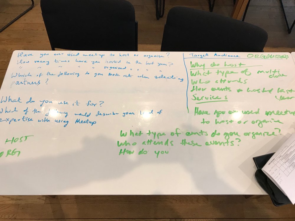 Brainstorming Screener Survey Questions
User Interviews Brief
- 7 user interviews
- 25–65 years old
User Interviews Questions & Insights
- How important is the role of an event space?
-
“You can have a really awesome event space, but it doesn’t matter if only two people show up and it’s sad.”
- What is the most difficult part of organizing event?
-
“Availability — Even if you find a day that works, you also have to consider a specific time slot.”
- How do you find new venues?
- “If I’m interested in a venue, I’ll walk in and ask what their availability is. They almost always refer me to someone else.”
Synthesis
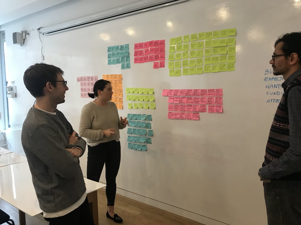
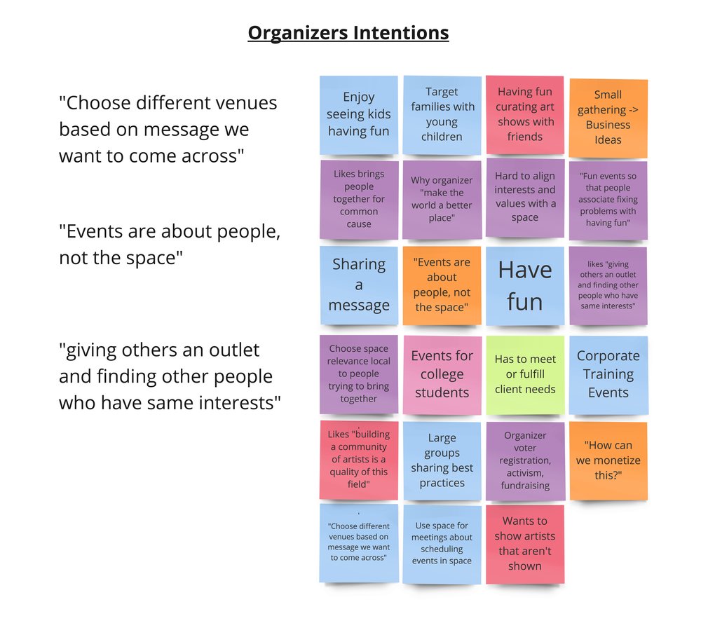
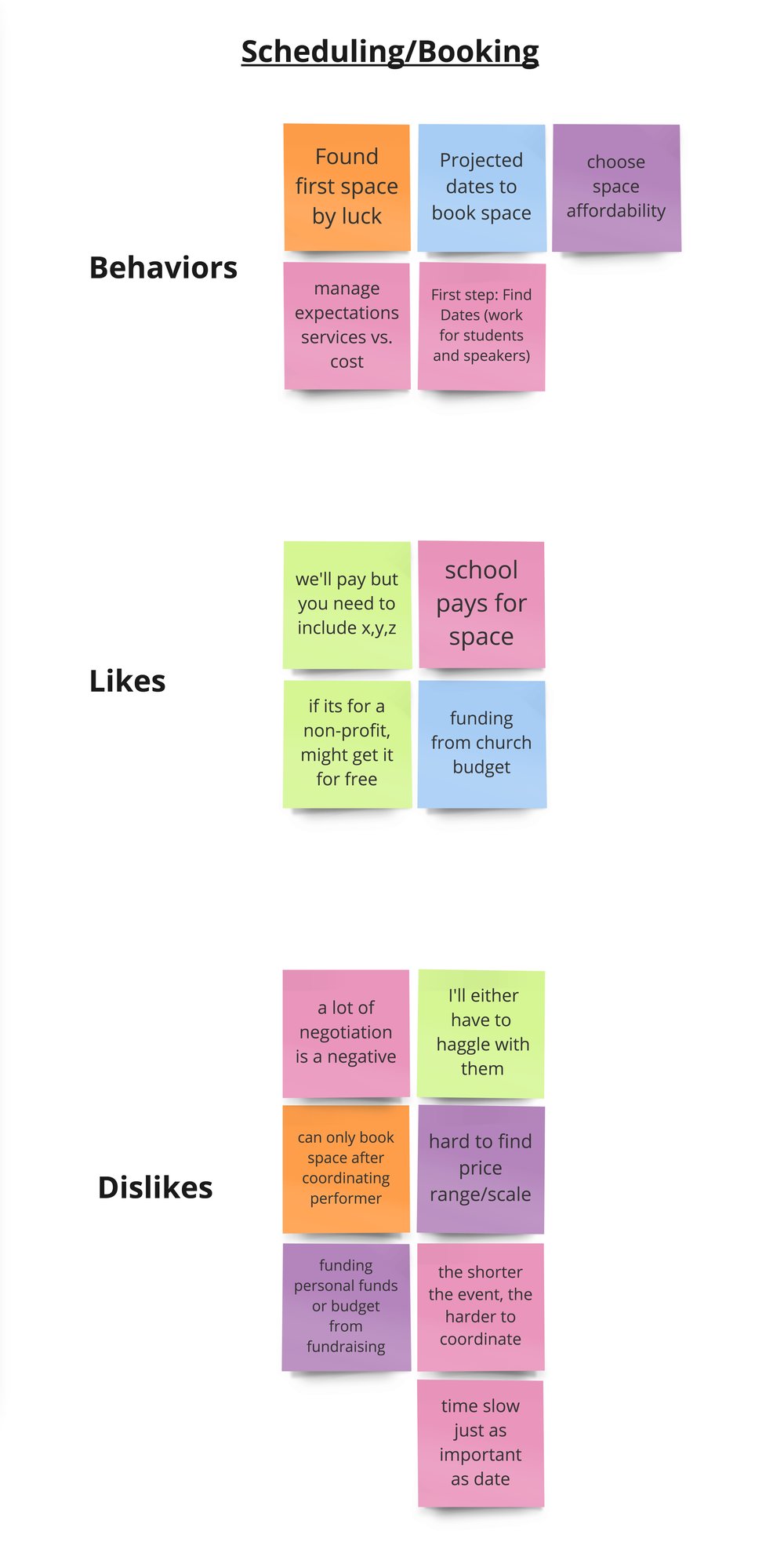
Affinity Map
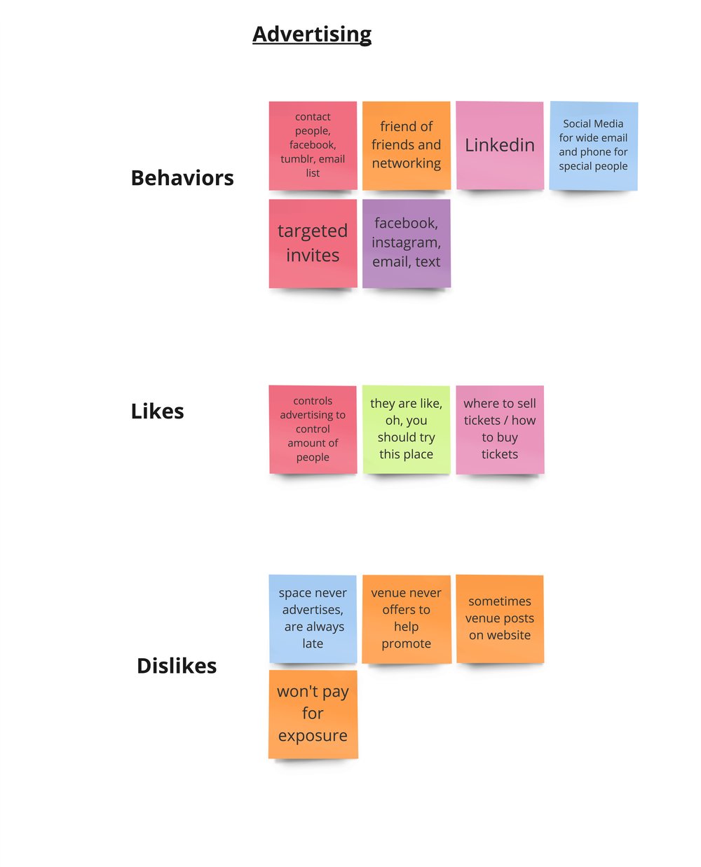
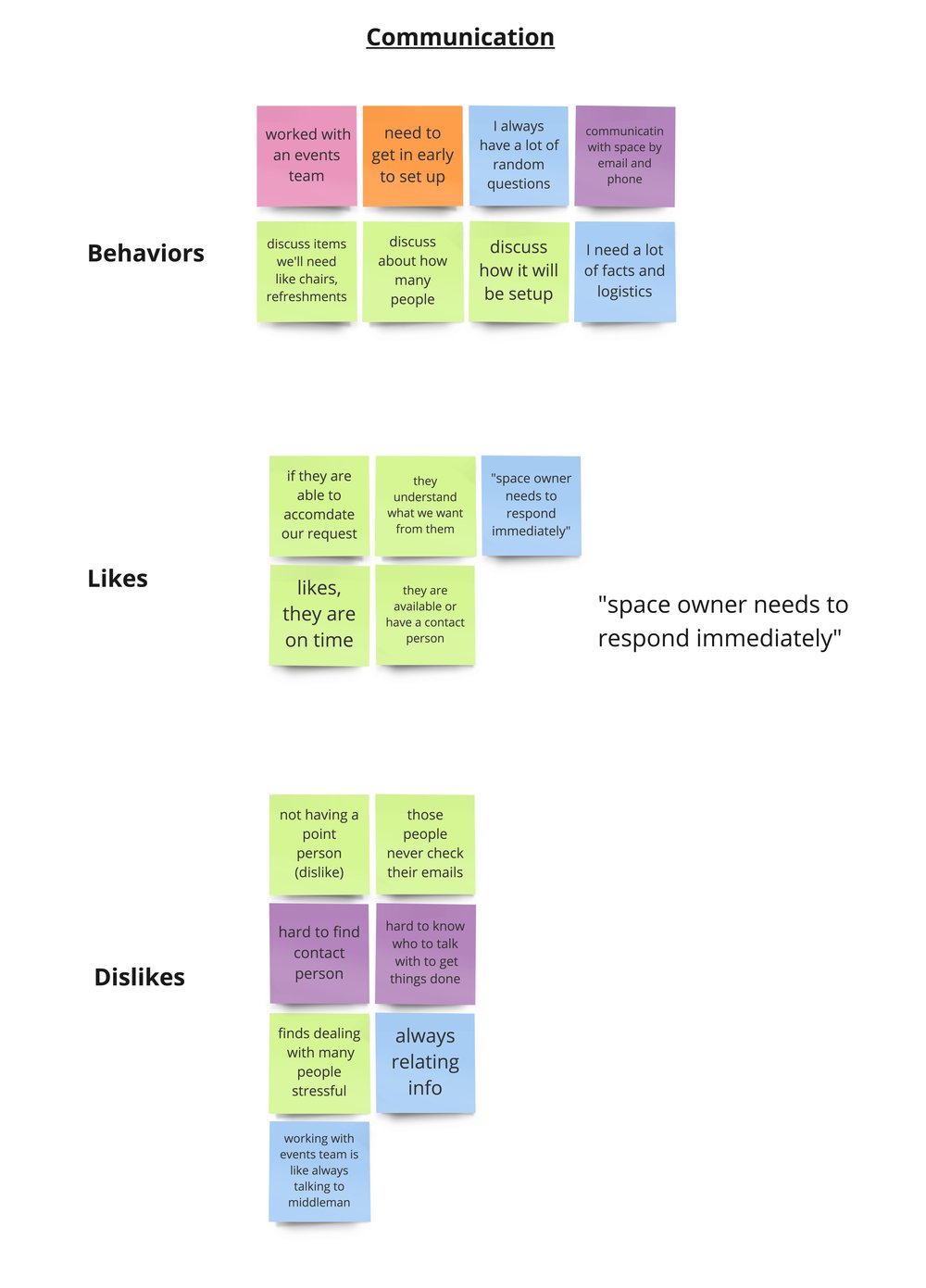
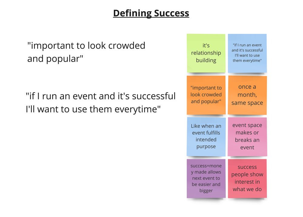
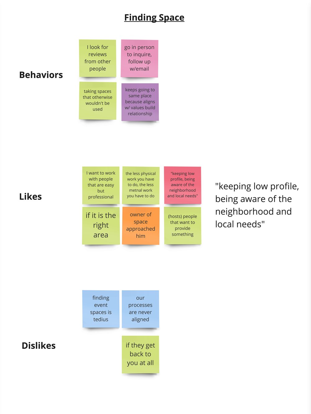
To better understand the problem spacer for event organizers by arranging our insights into chronological order of the event creation cycle. Then we broke it down even further into likes, dislikes and behaviors of the users.
We discovered 7 major areas for organizers:
- Event organizer’s motivations
- Researching venues
- Finding a venue
- Scheduling and booking
- Communicating with venue team or point person
- Advertising and marketing event
- Measuring and defining success of the event
We learned that the problem space spanned between (2) researching and (5) communicating logistics.
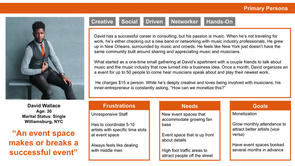
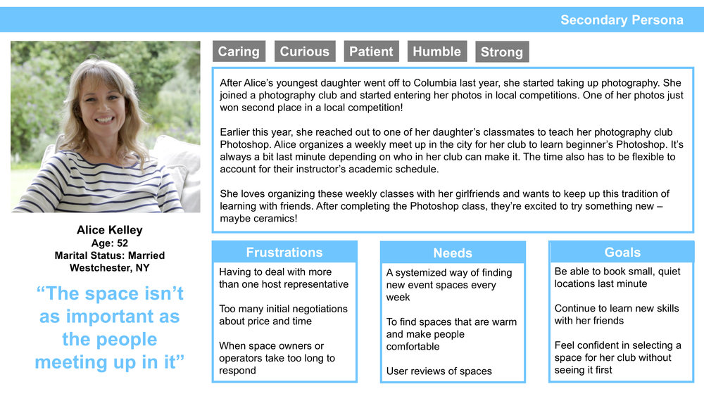
User Personas
From our research insights we created two personas, David Wallace and Alice Kelley.
Both personas, David and Alice, exhibited different issues creating events to organize others around their interests.
Planning in advance versus specific search in a rush.
Problem Statement
Organizers are constantly burdened with the details of booking an event space.
David Wallace wants to know more about the space before reserving it. How might we provide him with effective information and communication tools to connect with the event space?
*Without disrupting the primary use of Meetup, connecting people to events, we wanted to find a solution for this problem and focus on David as our user.
Design
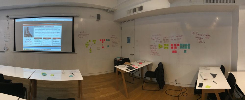
Design Studio
The Design Studio Process Cycle: 1. Review Research 2. Brainstorm (Ideate) 3. Critique 4. Refine 5. Review 6. Execute.
We conducted 3 rounds of the cycle.
1. David opens the Meetup app to plan an event in 6–8 weeks.
Insights
- Images are key
- Tinder meets Yelp functionality
- Image based discovery with high-level details
- Contact Info of venue
2. Alice opens the Meetup app to find an event space in a few days.
Insights
- History of previous, saved, or favorited venues
- Filter and search by tags
- Updated calendar for each venue
3. I manage a venue and I’m looking for someone to rent my space.
Insights
- Event Organizer profiles
- Tags help connect common interests
- View past or upcoming event list of event organizers
Our Final Insights
- Users want space info first with visual discovery
- Tagging and Messaging for easy connection building
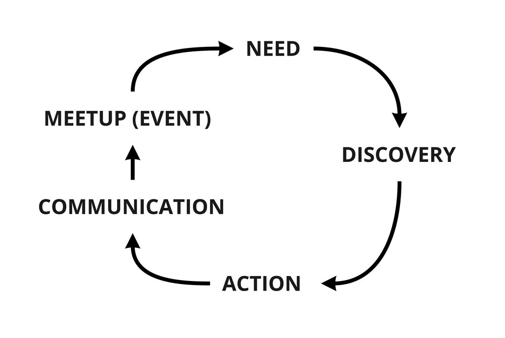
- A flow of Discovery -> Action -> CommunicationThis led us to develop this cycle:
User Journey
This led us to develop this distilled User Journey for David:
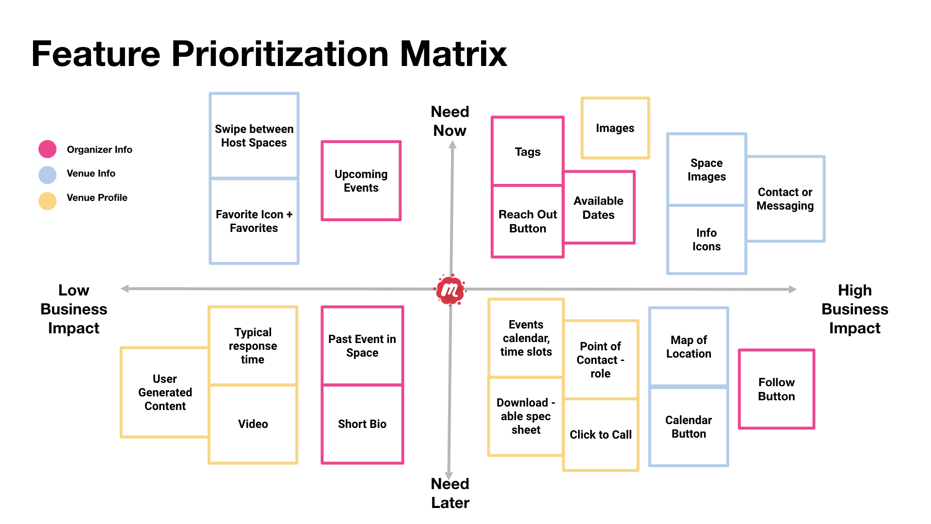
Feature Prioritization Matrix
Using the MoSCoW method (Must have, Should have, Could have and Would like but won’t get).
Our focus features:
- Images
- Informational icons
- Contact / Messaging
- Tags
- Availability — Calendar / Ask Button
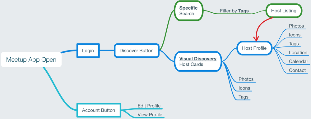
User Flow
To better understand the features we prioritized we designed a User Flow to help build a course for our personas to run through.
Wireframes
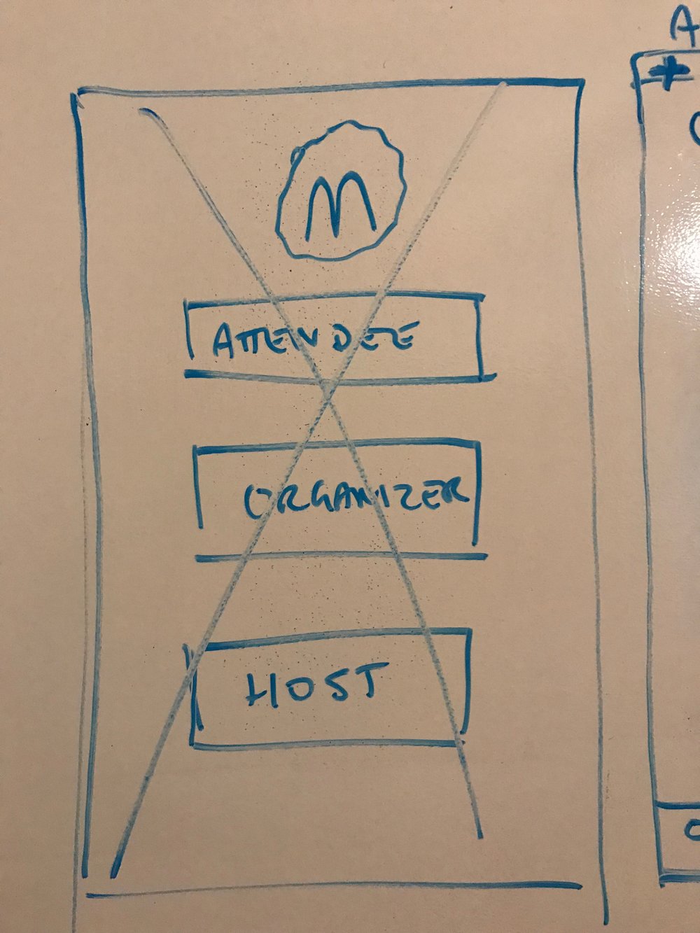
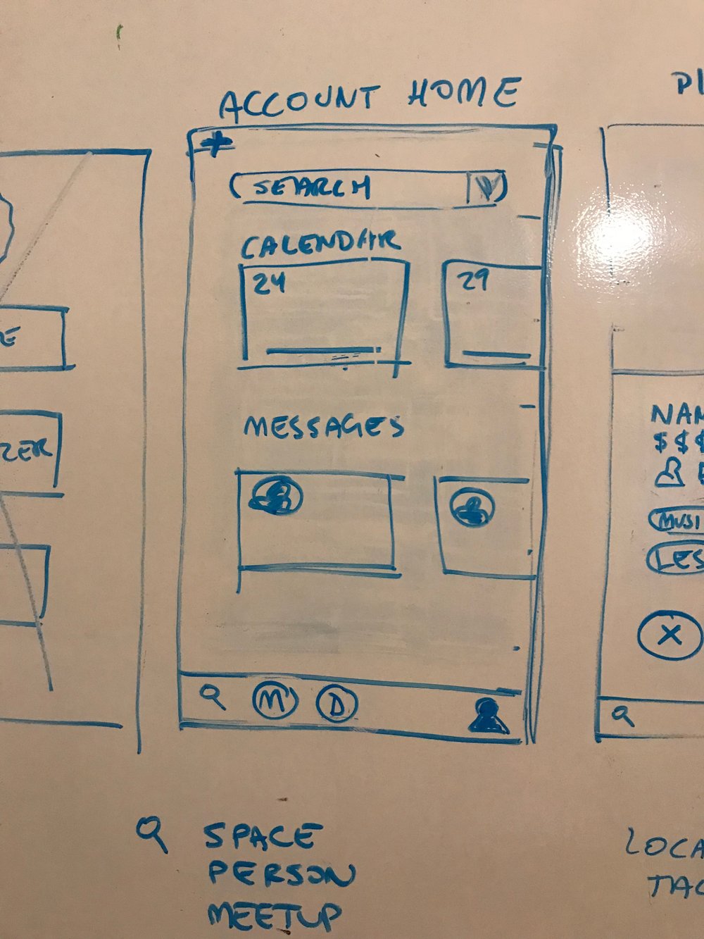
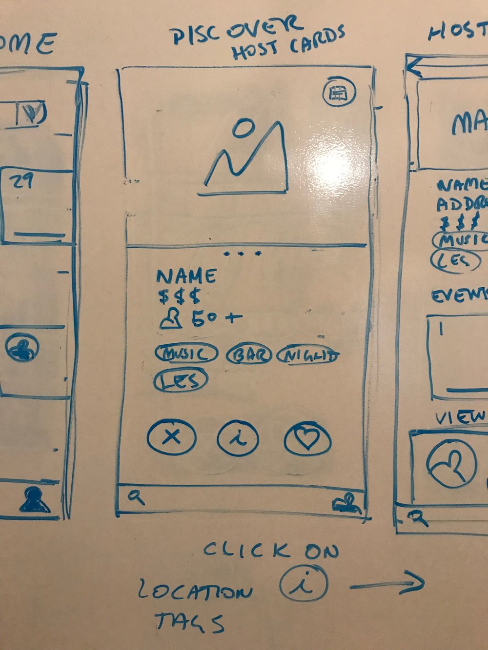
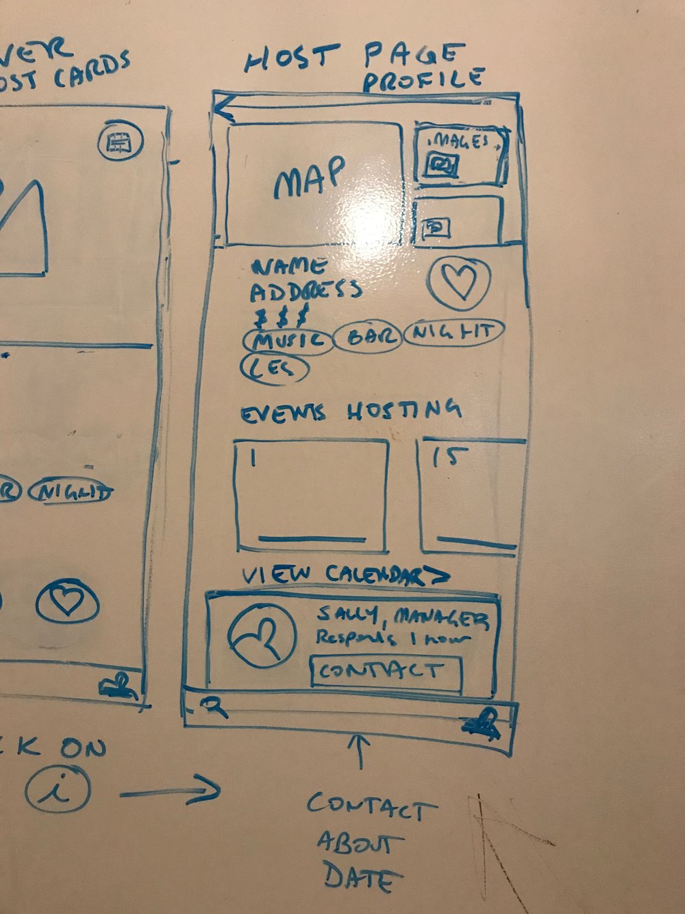
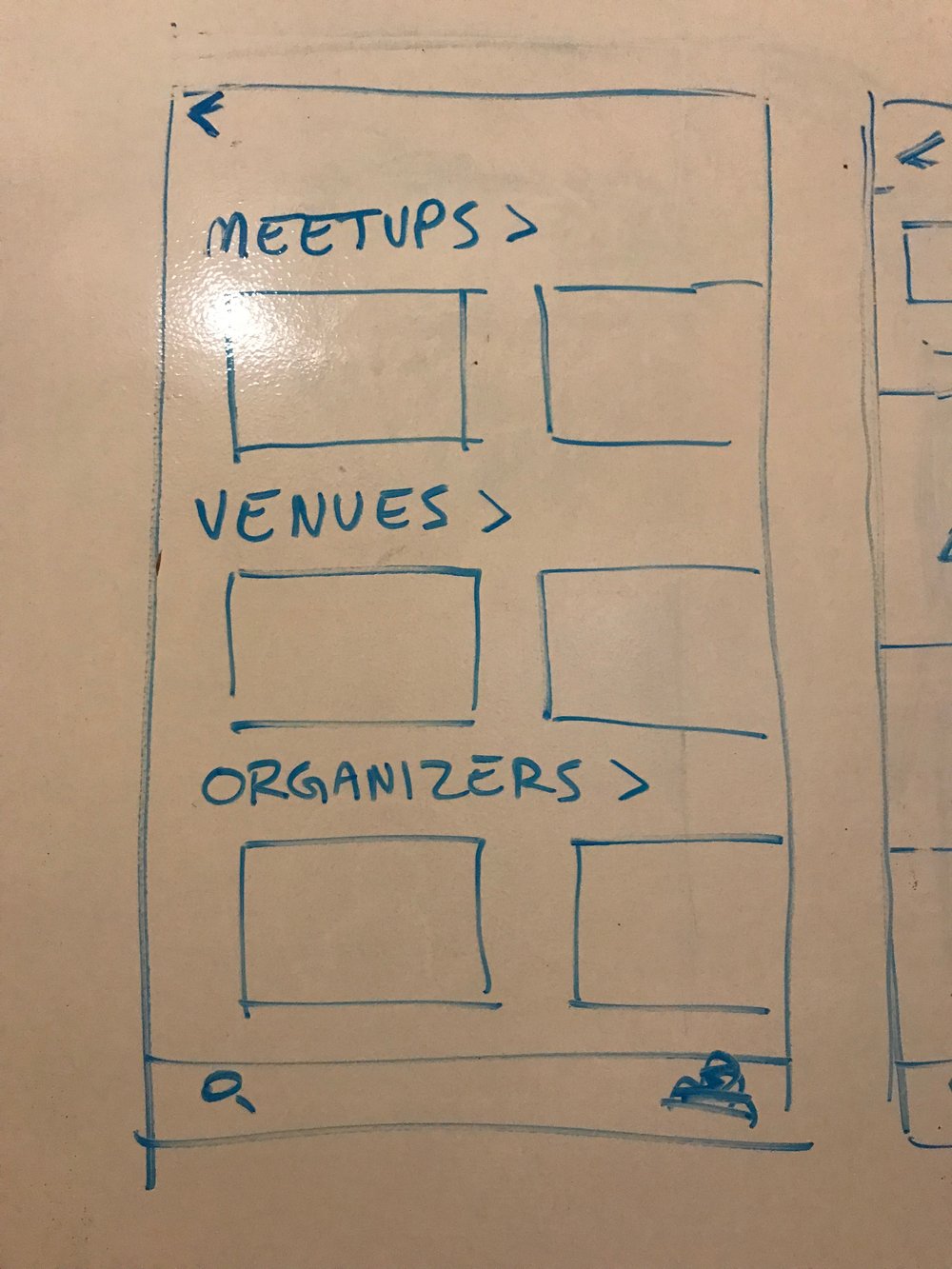
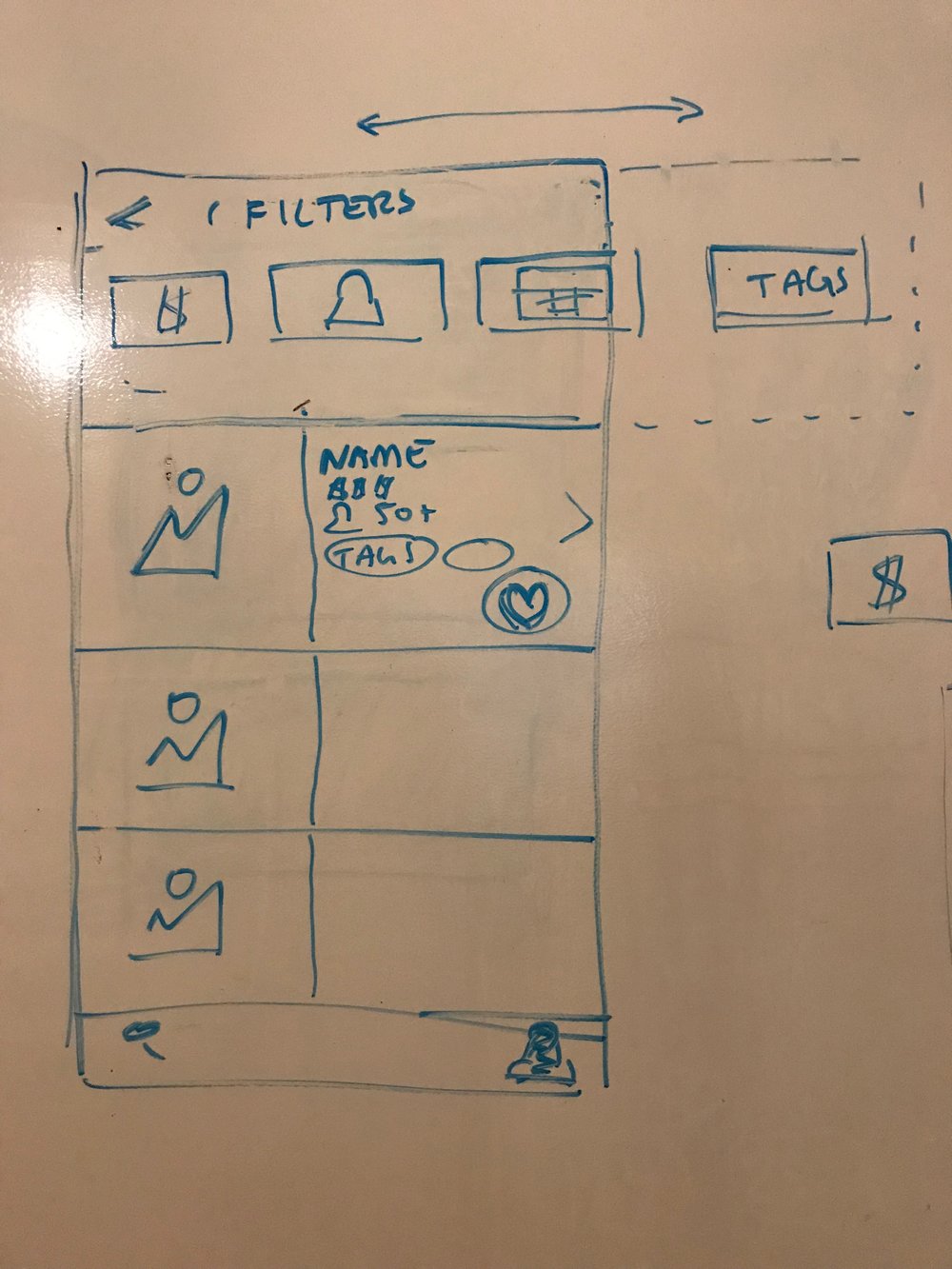
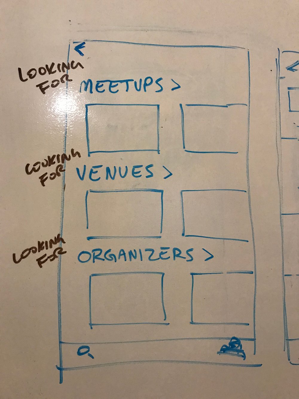
Before jumping into building a prototype, we designed together on a whiteboard some of the screens that would house our features and flow.
Solution (Prototype)
Usability Testing Brief
1st Iteration
- 4 Users
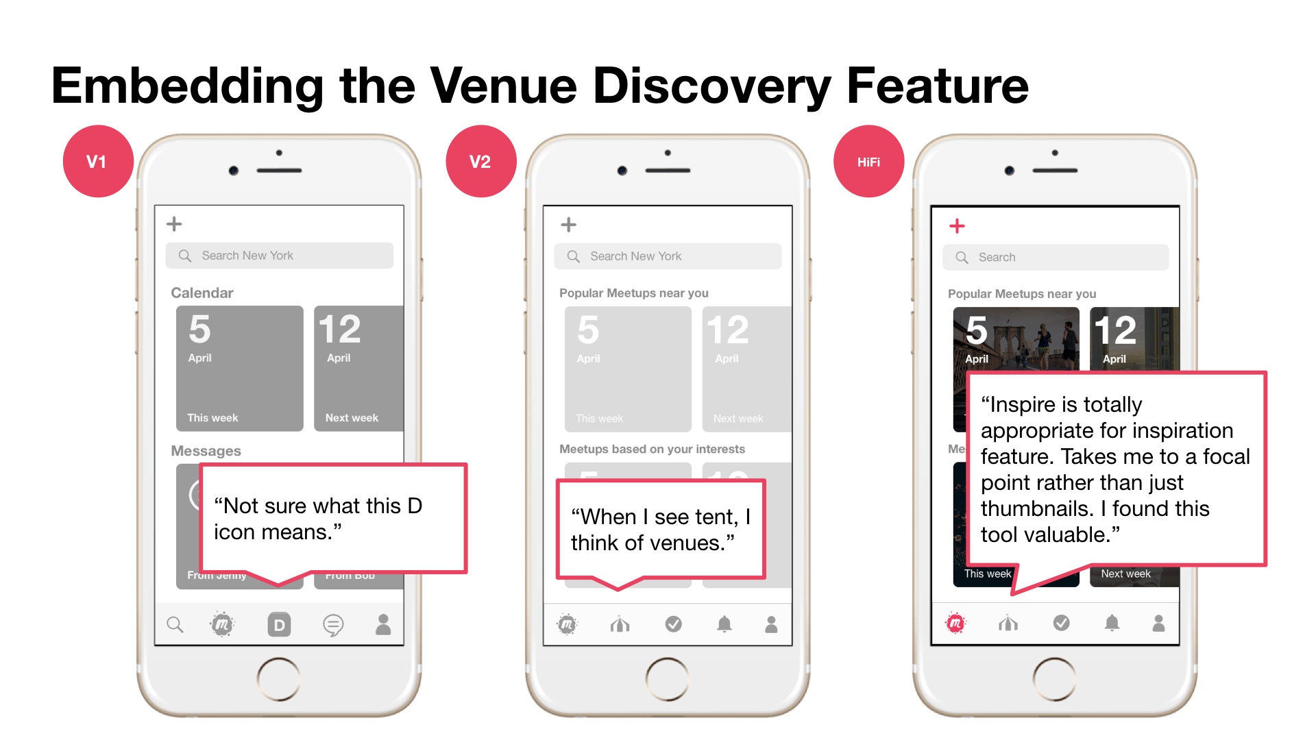
- We assumed that embedding our feature the ‘D’ icon in the center of the main navigation would allow for easy access, but found 0 out of 4 users tapped on our discovery tool — only after they completed the asked tasks using only the search bar for both tasks did they explore.
- The search icon from the original Meetup app confused users since they did not expect it to take them to the home screen.
2nd Iteration
- 5 Users
- Combined search and the Meetups page under the Meetup icon to create a clearer home icon.
3rd Iteration
- 2 Users
- Changed our ‘inspiration’ feature icon into a carnival tent to attract users and to represent the idea of a venue.
Usability Testing
David’s Scenarios and Tasks:
You’ve created a big event that will happen in a couple of months. You are not sure what your next event’s theme might be but want to start brainstorming.
Task: Check out new venues for inspiration and add a couple to your favorites.
The last time you were in Meetup, you used the discovery tool and favorited a bunch of different venues that might be good for your next event.
Task: Go to your favorites list and check out the details of your favorited venues.
You’re in a rush to book a space for a Meetup later this week. You know exactly what you’re looking for in a venue (number of people you need to accommodate, price, etc.)
Task: Search for venues that fit your needs.
You’re beginning to plan an event that will happen in 6–8 weeks.
Task: Create an event in Meetup and find inspiration for a venue. Message the point of contact.
“Interactive element of being able to swipe through, is a very satisfying discovery tool. Turns cumbersome process into something that’s enjoyable.”
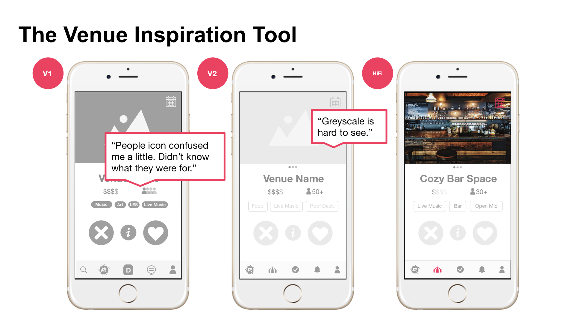
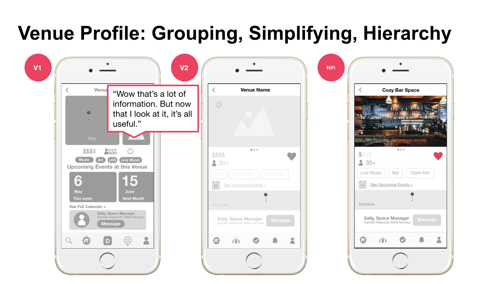
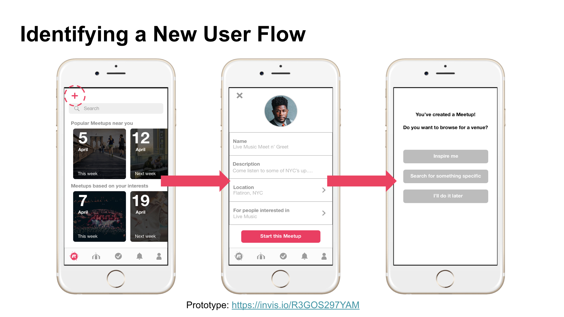
Conclusions
- Users found images and colors helpful orienting themselves in the app
- “Finding a venue was easy, showing possibilities immediately”
- Users curious about their own intent and pacing through the app when presented with different scenarios or their own — how might the two search functions work them
- “If I knew the sense of urgency and the sense of exploration was differentiated.”
- Users find ‘favorited list’ easily but wonder if it should be its own function
- Users like filters during specific search but wants them available at the start of search not just to narrow down results
- Users ask for more information on Venue profile like website link
Next Steps
Goals
- We completed 2 usability tests for our High Fidelity Prototype but would like to do more usability tests to gain better data and insights.
- Adding additional information to Venue profile
- Build out a flow for Venues to find Organizers
- Creating a ‘favorited’ area in app for centralized favorites
- Creating more scenarios to test other aspects of app like attendees flow
What does this mean for Meetup?
- Increased growth rate of Meetups
- Higher average ratings in App Store
- Additional revenue opportunities like charging venues to appear first in ‘Inspiration’ tool and in search
What I Learned
- Provided a great opportunity to review techniques as well as implementing some UX strategies like Design Studio and Feature Prioritization.
- At times it was difficult to align everyone’s working methods and pacing but we found that each member could contribute to the project through a collectively created task list and delegation.
- I learned about myself is that I focus sometimes on the details too much and need to step back to see the larger picture.