Realigning the Racetrack
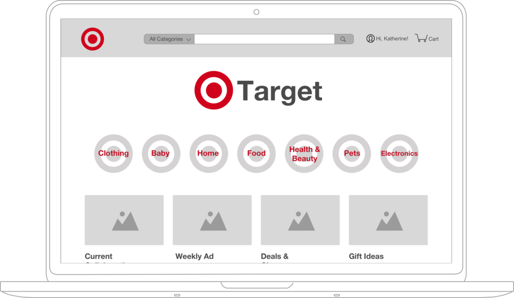
Abstract
Experience: Digital
Type: Research & Information Architecture - Target
User Persona: Katherine Nagel
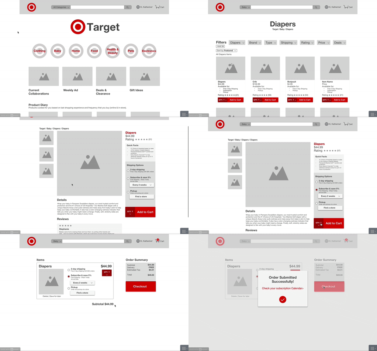
Objective: A comprehensive breakdown of Target’s “Racetrack” concept in an attempt to unify the in-store and the online experience to help Katherine get her baby’s diapers.
Realigning the Racetrack for Target
Context: Target’s customers love Target and typically enjoy their shopping experience in-store. Customers value good deals on essentials and trendy items but they often abandon their shopping online at Target.com to have the in-store experience instead.
Problem: How might we recreate the same easy and convenient shopping experience for items on Target’s website as users have in-store?
Solution: A comprehensive breakdown through research of Target’s “Racetrack” concept in an attempt to unify the in-store and the online experience to help Katherine get her baby’s diapers.
Solution
Katherine finally has some time on while her husband and baby sleep. She is looking for an easier way to get her necessary items to cut down on the amount of time she spends in-store at Target.
Project Brief
Project: Reflect the in-store experience on to the online store
Scope: Extensive research of customer experience, competitive analysis, heuristic analysis, redesign of online store
Duration: 2 weeks
Team: Sean Ward, Frances Biedenharn, Mary Rizaldo, Nick Townsell
My role: Researcher, Designer, Project Manager, Information Architect
Goal: Understand the success of Target’s in-store experience and discover opportunities to reflect these insights in Target’s online store through a proposed redesign.
Basic process: Business Research > Industry Research > User Research > Heuristic Analysis > Synthesis > Design > Prototype > Test > Responsive Design > Next Steps
Timeline

Business Insight, The Racetrack
Target designed and implemented the ‘Racetrack’ concept in their stores to provide a consistent experience across each location, no matter where in the world.
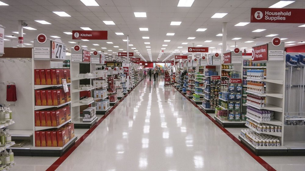
“…Target features a more open layout with broad sightlines for easy navigation.”
- Nancy Devine, Senior Group Manager, Store Planning and Design
“Logical layouts, uncluttered aisles and the clean look of our stores allow our guests to easily find what they’re looking for. It makes shopping a pleasant and consistent experience in any Target store.”
- Tina Schiel, Executive Vice President, Stores
Source: Then & Now: Target’s Store Design Philosophy
User Research
Contextual Inquiry
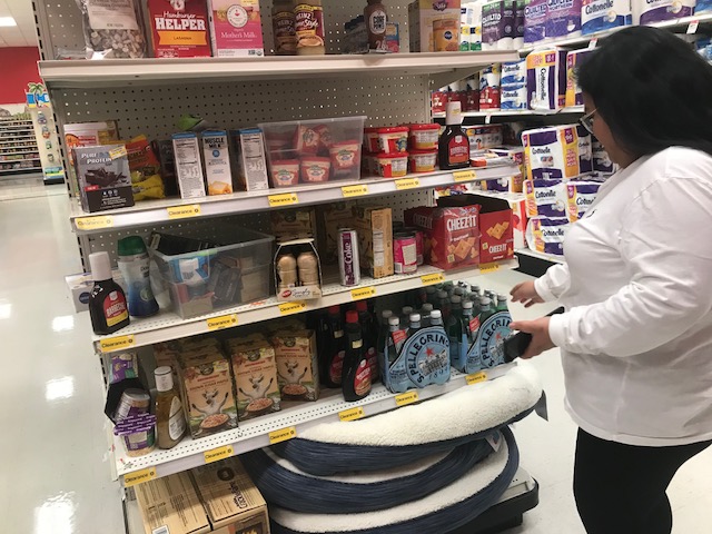
In-Store (4 Users)
- Users really do love Target’s in-store experience
- Users will leave with more items than they came in to get
- Users used Target.com to check items and prices before heading into the store to shop
- Users believed that in-store might have a better deal than online or something similar that is on sale
Online (3 Users)
- Users got lost navigating the website
- Users abandon search feeling online inconvenient and proposed going in-store to shop was more convenient
- Users didn’t want to spend time browsing through navigation menu so they used search bar to type
Usability Testing of Current Online Store (6 Users)
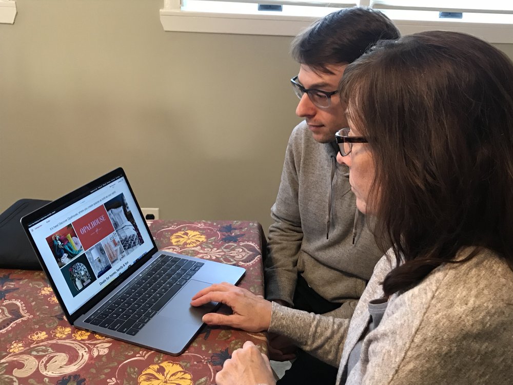
- 0 out of 6 users completed specific tasks around shipping options or special services and for other simple tasks many users abandoned the task or felt they should compare the item found with another competitor before buying online or ultimately going in-store.
Card Sorting
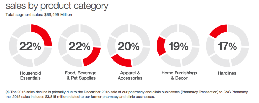
We questioned Target’s categorization methods using their best selling categories from their annual report with customers using card sorting.
Open (4 Users) & Closed (3 Users)
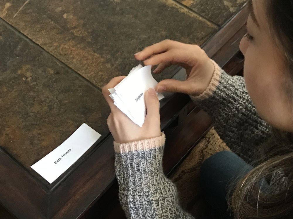
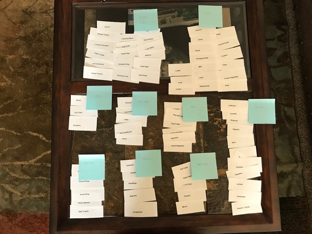
- Users found by having context through juxtaposing items under a category created better understanding and meaning about the items
- Users sorted (open & closed) by thinking of how they would use each item
- Users grouped items by frequency of use or if they ever moved around in a space
Competitive Analysis
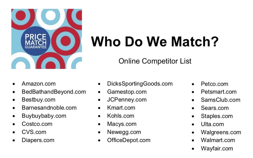
We identified competitors using Target’s own Price Matching Online Competitors List and other businesses based on their systems of convenience, loyalty, and rewards.
MAIN COMPETITORS
- Walmart
- Costco
- Amazon
AREAS OF INTEREST
- Shipping Options
- Deals
- Curation
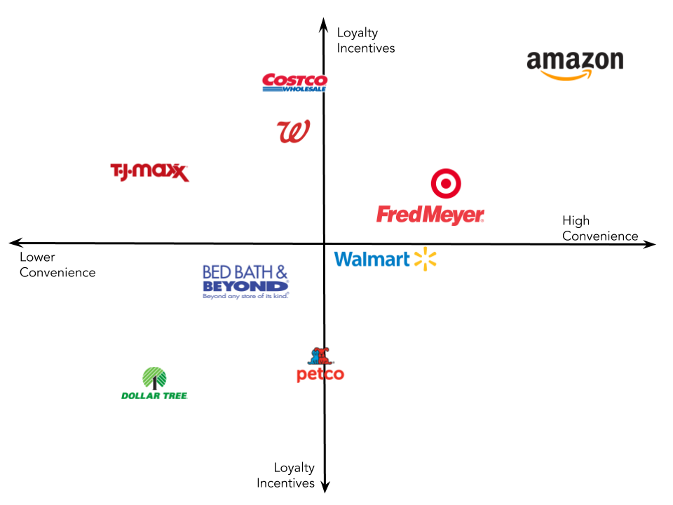
INSIGHTS
- Opportunities for improvement in both Loyalty Incentives and Convenience
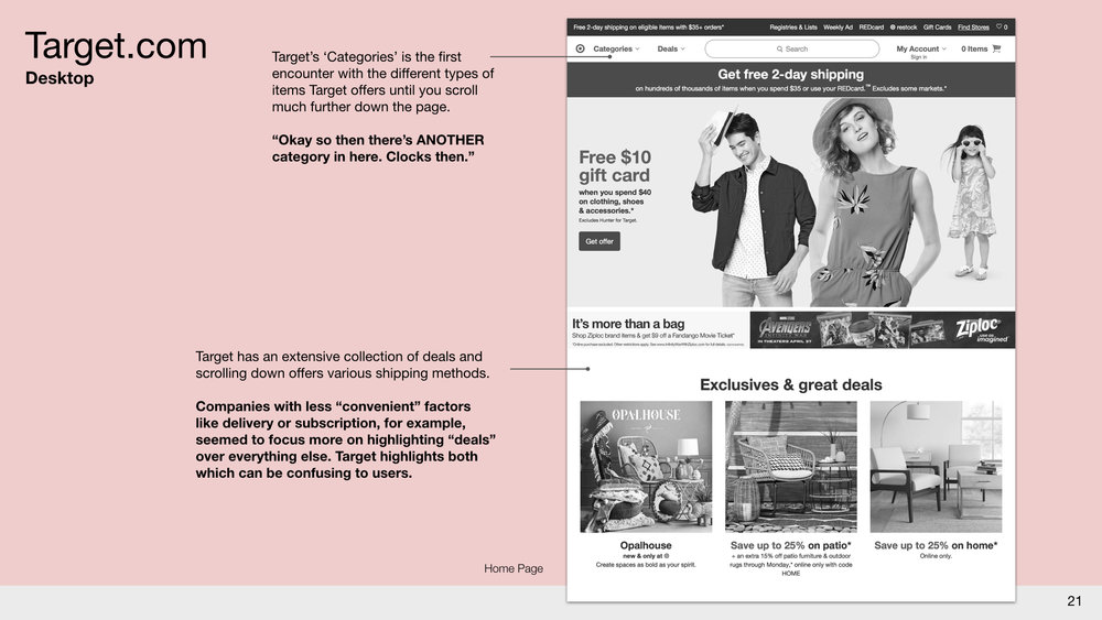
- Companies with less “convenient” factors like delivery or subscription, for example, seemed to focus more on highlighting “deals” over everything else. The exception here, is Target, who highlights deals and offers convenience and delivery.
Heuristic Analysis
Score 3.0 (Scale of 1 to 5, 5 being best)
Pros
- Many digital features online like a 3D visualizer for nearly all products
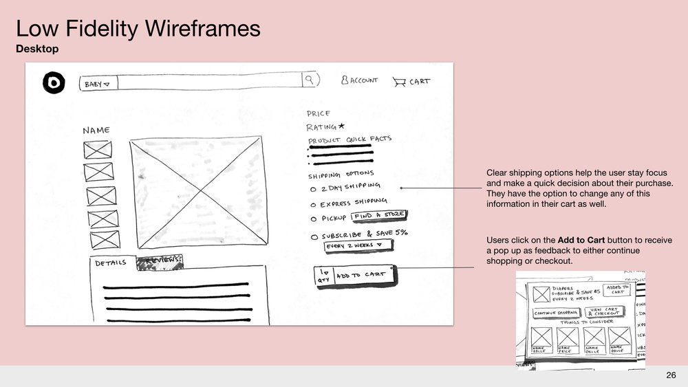
- Extensive shipping options
Cons
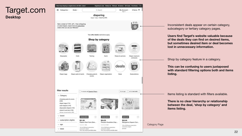
- Difficulty in navigation with a seemingly infinite categories drop-down
- Readability of homepage
Result
- Competitors with better navigation though lacking in features are quickly taking advantage of Target.com’s hierarchy issues and racing ahead. Amazon opening up physical stores, Walmart steadily updating their online shopping options.
Recommendations
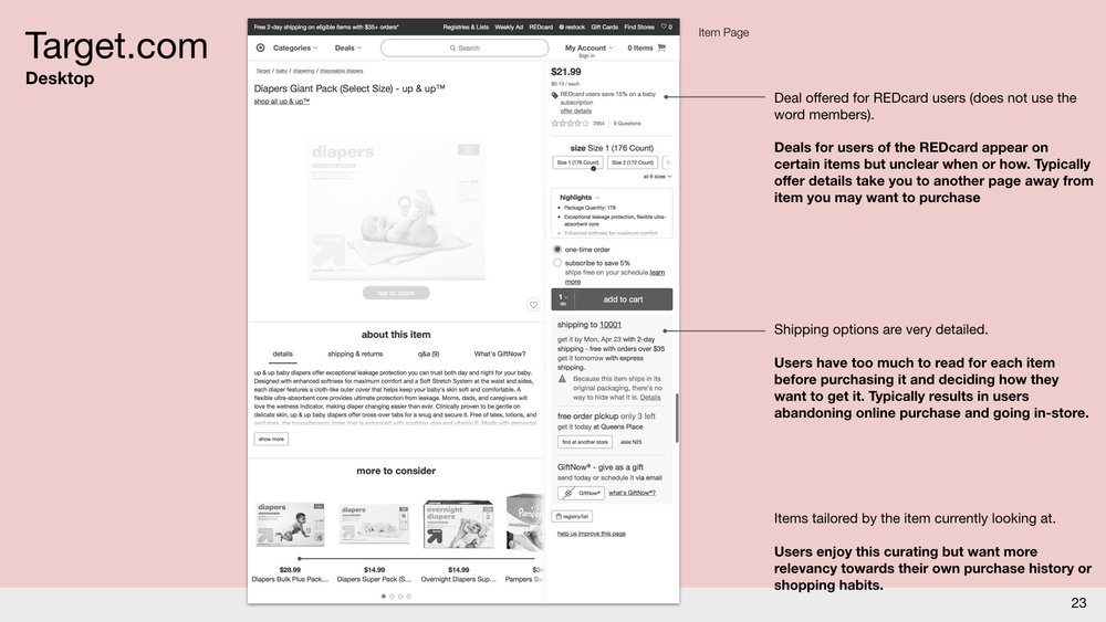
- Target has expanded its delivery services and other special programs which should be highlighted more with better instructions and videos showcasing its use cases
- Users find Target’s website valuable because of the deals they can find on desired items, but sometimes desired item becomes lost in unnecessary information
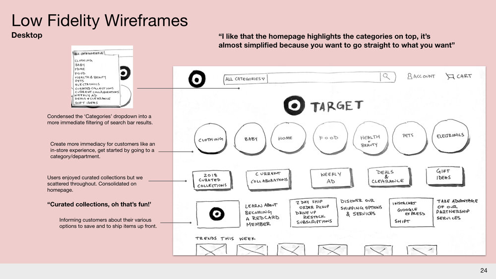
- Make the homepage more memorable or an access point to relevant information for users, this could be an area to showcase and learn about the brand and its curated items
Synthesis
- Target users are not fully aware of special services or shipping options, REDCard membership is not clear or valuable, and unknown availability of items or services in their current location.
-
Target users were mostly concerned with visual discovery, simple categorization and how they can get the item easiest (clarity around obtaining item).
- Affinity Mapping revealed a cycle of Research, Curation, Transaction, and Post-Transaction behaviors and attitudes.
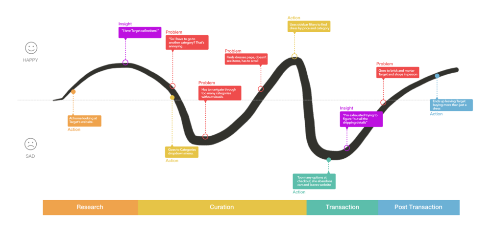
Many Target users start their shopping experience online at Target.com, searching for an item, becoming frustrated with infinite categories leading to feeling like they were missing something and/or not getting the best deal, resulting in giving up to find the item or something similar at their local Target.
Katherine Nagel, 35
Public School Teacher & New Mom
“I like searching for a specific item, it cuts down on what I have to look at. If I don’t then I can’t make a decision, unless you have nothing else to do and you want to look through the whole website. That usually doesn’t work for me.”

GOALS
- Understand new ways of getting her essentials quickly
- Easy ways to research quality and safe goods for her family
- Save money when shopping for items
PAIN POINTS
- Shopping at Target to pick up supplies for newborn adds stress to already busy schedule
- Both parents work during the day
- Doesn’t have time to learn how technology can help her
The Problem
How might we help Katherine shop online at Target’s website, giving her options to have her essentials met by automatically sending them to her home in order to reduce her need to shop in-store while having the same familiarity?
Information Architecture Redesign
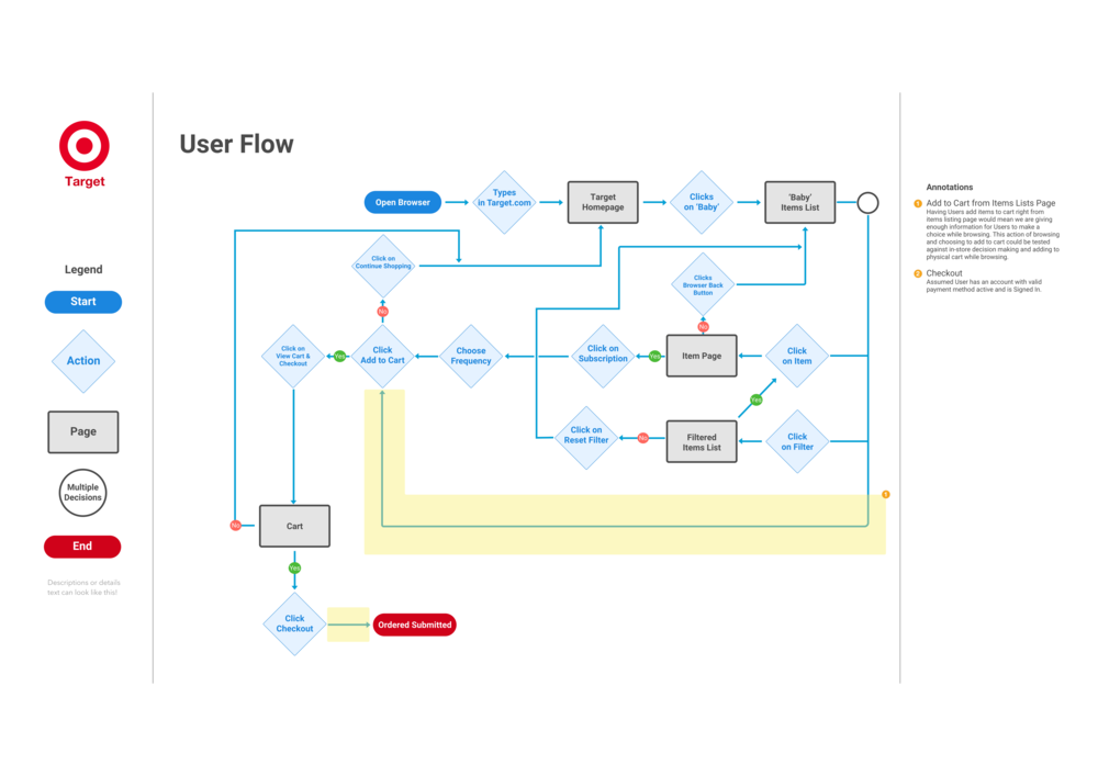
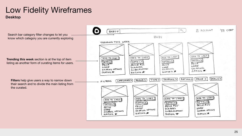
Redefining the site map ( reorganizing Target.com’s categories) and revising the user flow keeping Katherine in mind were the first steps to begin designing Target’s Online Store ‘Racetrack’.
Site Map
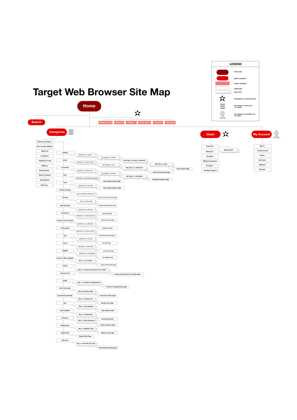 Target.com - Site Map, Original
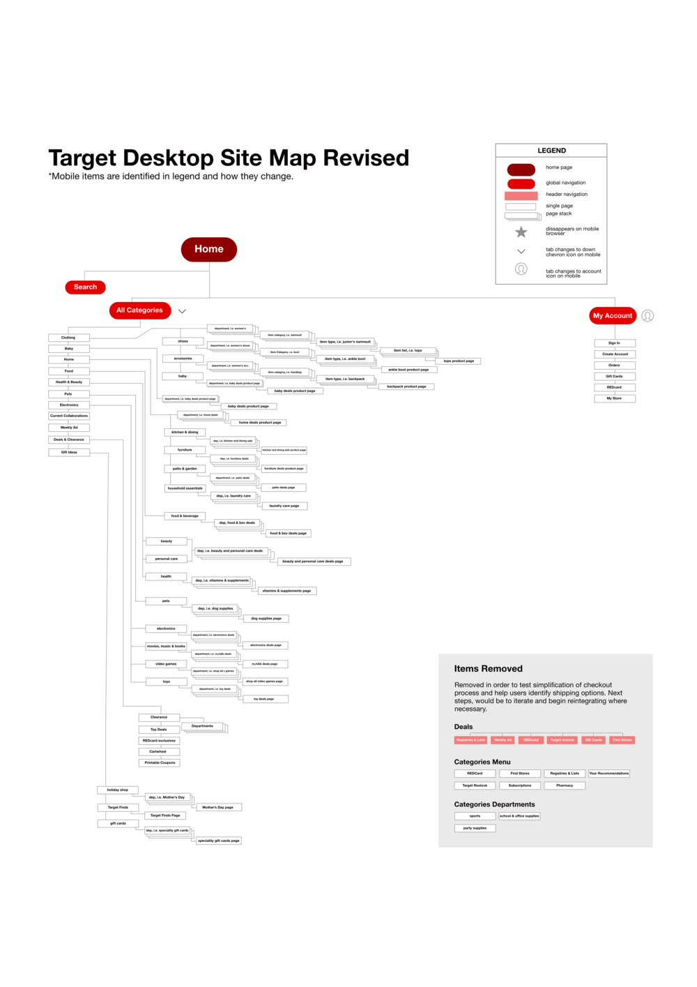 Target.com - Site Map, Revised
Task Flow

User Flow
Fidelities
Low Fi
Mid-Fi
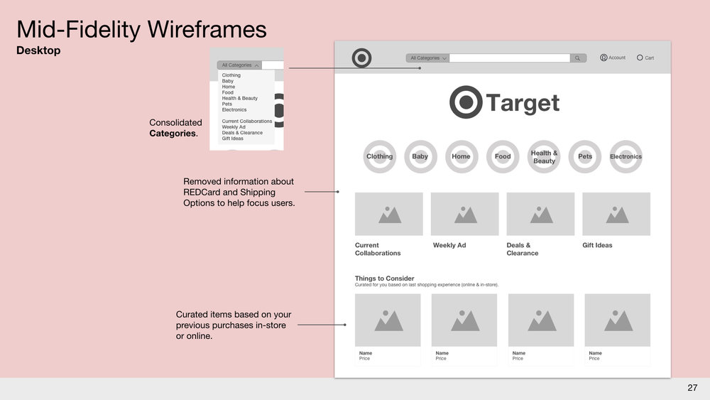
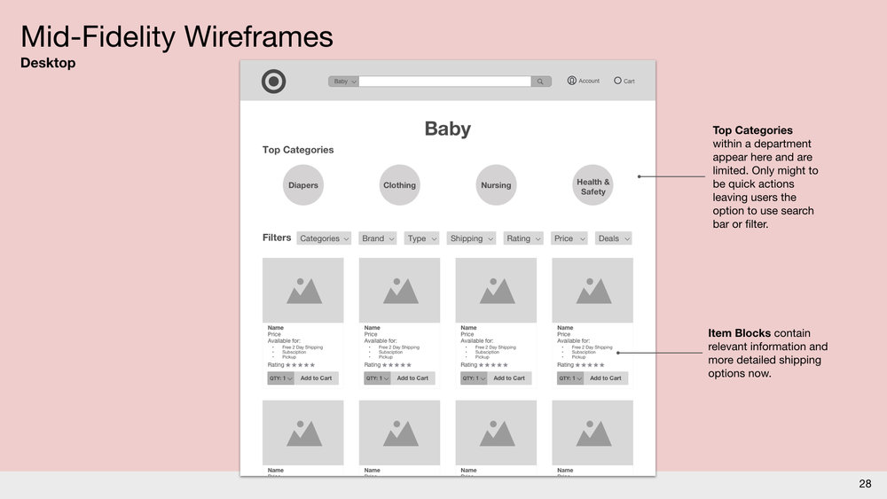
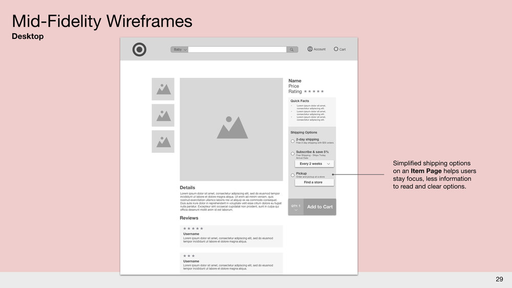
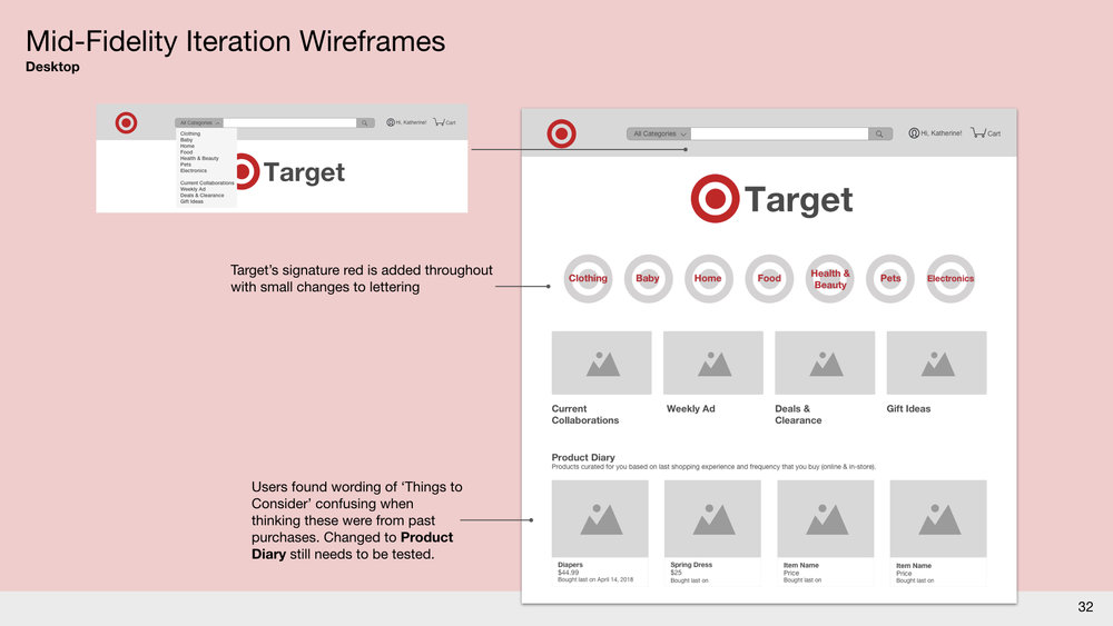
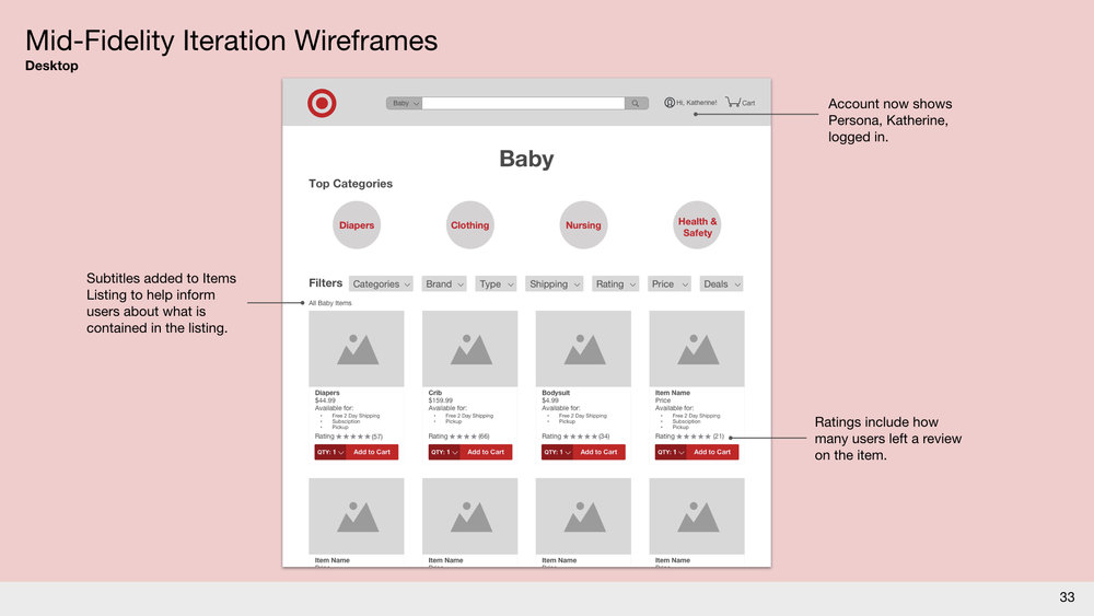
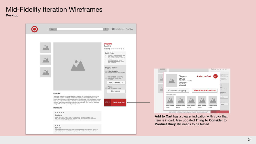
Mid-Fi, Iterated
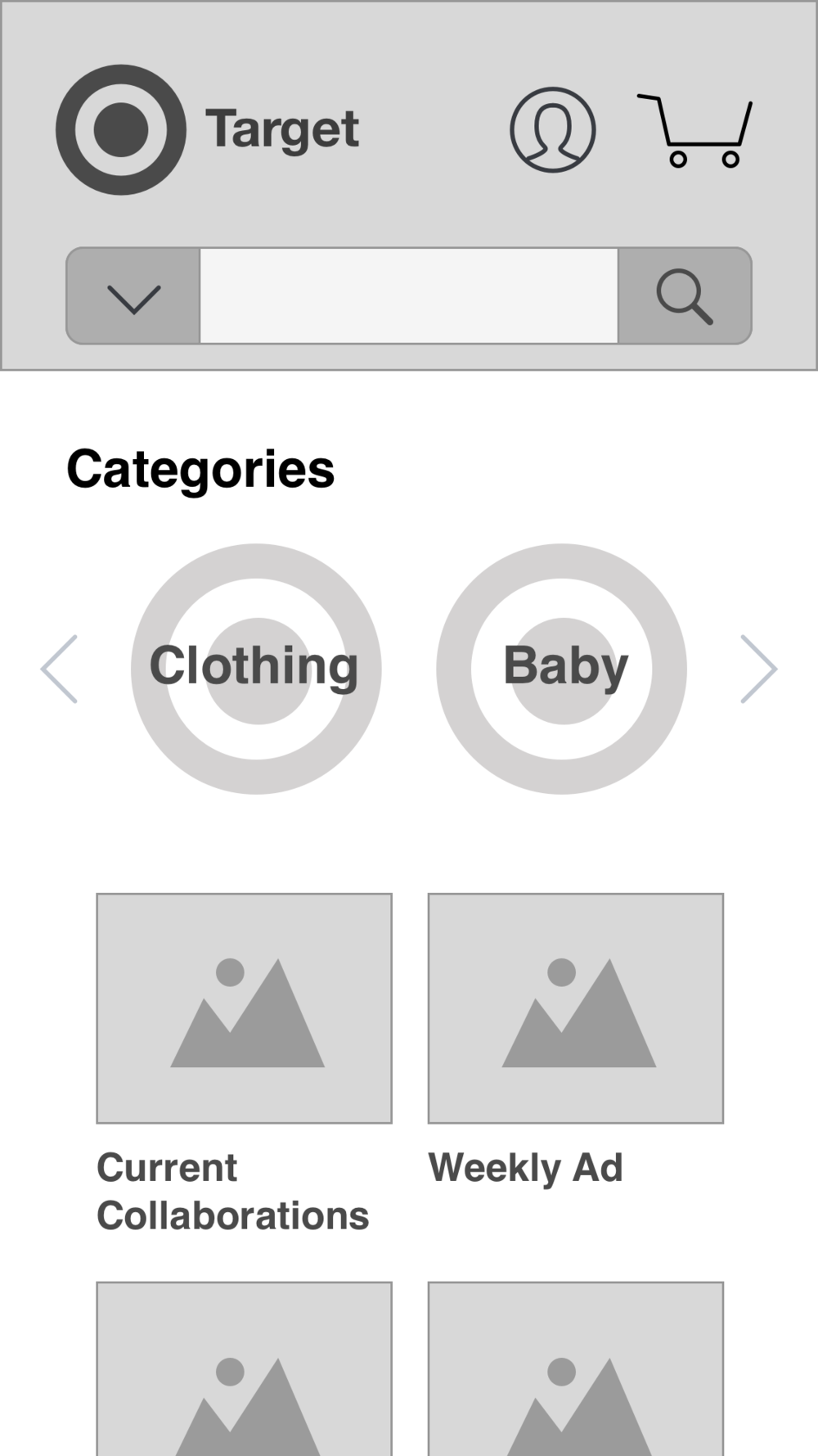
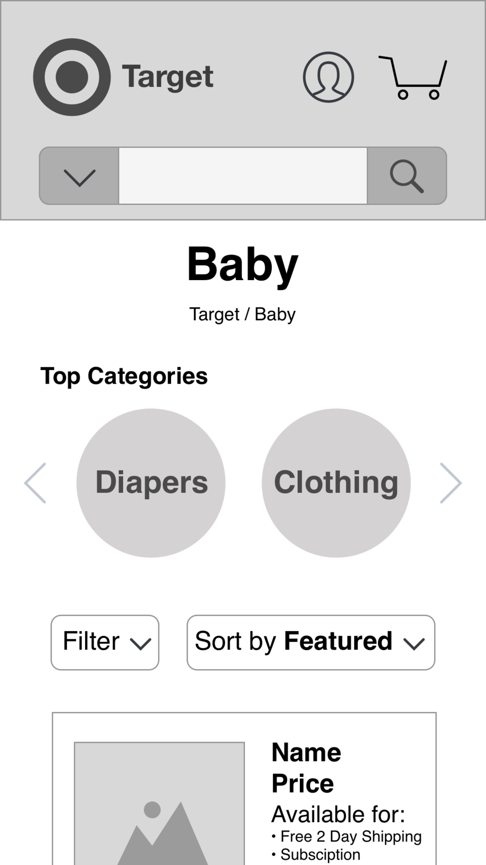
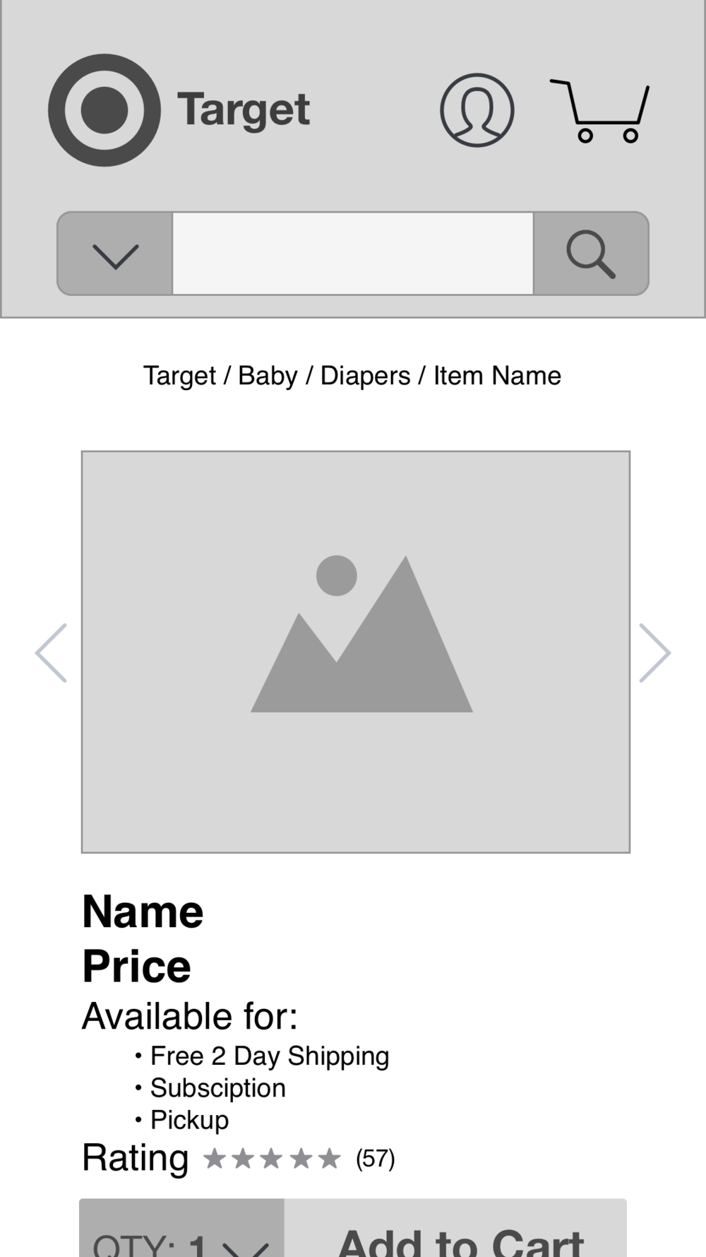
Responsive Design, Mobile
Mobile was not tested but I developed key screens to demonstrate the responsiveness of the redesign.
Next Steps
I would like to take the concept of the ‘Racetrack’ further into blending in-store and online experiences trying to answer these questions.
- How can the in-store racetrack be explored online?
- Is Augmented Reality or Virtual Reality a solution?
- Would this have any effect on the in-store experience?