Nurturing Creativity
Abstract
Experience: Digital & Tangible
Type: Business Concept - Doodleverse
User Persona: Damien
Objective: A mobile experience to inspire and motivate Damien in his art learning and development.
Nurturing Creativity with Doodleverse
Context: Adults feel that their creative learning is most effective in structured environments with guided instruction, buildable elements, and feedback. Adults who have creative interests but lack confidence in their abilities have difficulty accessing these structured environments to pursue their interests.
Problem: How might we build a digital tool that provides step by step instruction anywhere and builds their creative confidence?
Solution: A mobile experience to inspire and motivate users in their art learning and development.
Solution
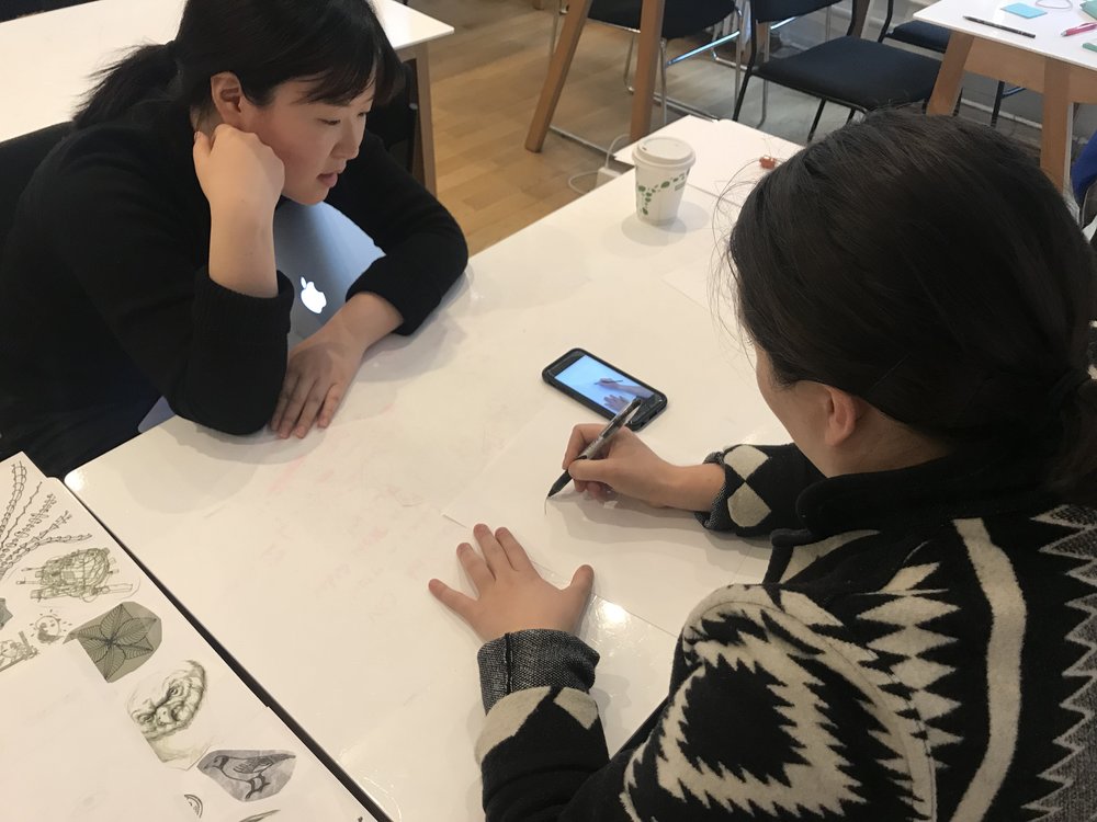
Damien has downloaded Doodleverse the night before heading into work. He carries his pen and sketchbook with him everywhere as a reminder to find some creative time. Damien is currently at lunch and decides to try out Doodleverse with his pen and sketchbook.
Project Brief
Project: Digital & tangible art creation tool
Scope: Onboarding & initial exploration, step by step art lessons, sharing with other users
Duration: 2 weeks
Team: Sean Ward, Bryna O’Neill, Jae Kum, Talia Saltzman
My role: Researcher, Designer, Product Manager
Goal: Discover how and why users want to learn/value art making through research in order to understand opportunity areas and design a solution that inspires and builds confidence in user’s own creative activities.
Basic process: Industry Research > User Research > OKRs > Synthesis > Design > Prototype > Test > Next Steps > Potential Partnership Research > Partnership Pitch Presentation
Timeline

Research Discoveries
User Research Insights
10 interviews conducted -
- Value of Art as alternative way to communicate
- Drawing as a democratic art method
- Confidence is a barrier to development
- Guided art instruction through visual step by steps
- Open, collaborative environment keeps motivation high when developing a skill
Industry Research Insights
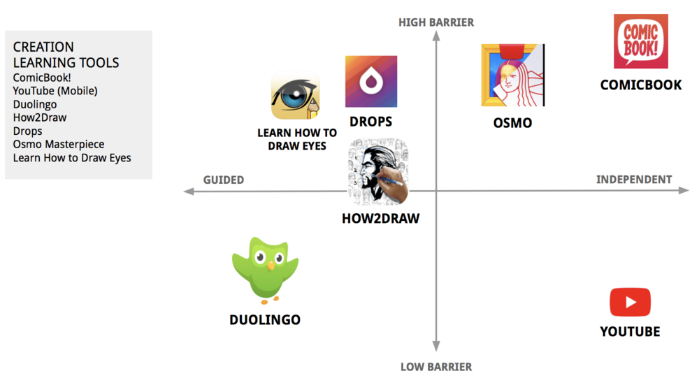
- Guided vs. Independent - measuring the amount of structure and guidance provided in the interaction and learning material between the device and user.
- Low to High Barrier - measuring the level of ease, cost, and accessibility as a whole
- Conclusion - We are striving to reside in the GUIDED and LOW BARRIER quadrant. We want users to get enough guidance to proceed in their learning without a high cost in time, energy & money.
Platform Choice
Based on our user interviews, competitive analysis and team goal of keeping the experience free and having a low barrier of entry we chose Mobile as our experience and Android (Android Global Market Share 85.0%) as our platform because of the market research we conducted.

Target User Age Bracket: 18-29
- Half of screened users fall in age bracket
- 94% own a smartphone
- 17% dependent on smartphone
We want to provide a democratic creative experience using both technology and analog techniques to increase accessibility because:
- 77% have home broadband access
- 21% make less than $30,000 as income, and mostly dependent on smartphone for internet access
- Hispanic 23%, Black 15%, White 9%
We want to engage learners that connect with educational content primarily using their mobile device
- Hispanic 45%, Black 32%, White 26%
Sources:
Pew Research Center - Demographics Mobile Fact Sheet
Pew Research Center - Racial and ethnic differences in how people use mobile technology
Creative Confidence Cycle
After analyzing and synthesizing insights from affinity mapping, user interviews and competitive analysis, the Creative Confidence Cycle emerged - revealing the journey of our users when learning a skill and how they build confidence to continue learning.
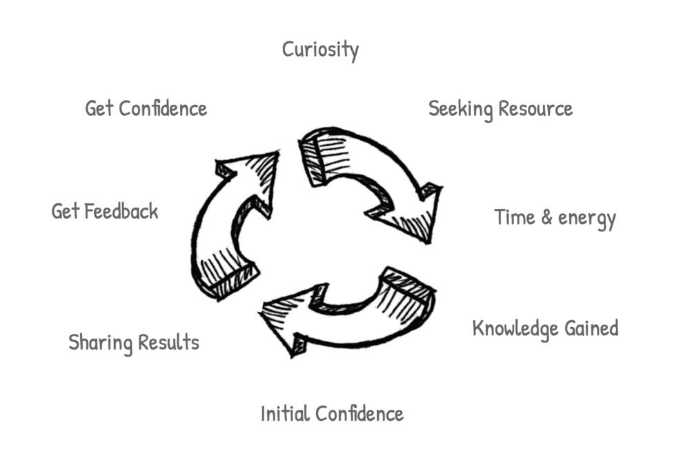
Creative Confidence Cycle Tested
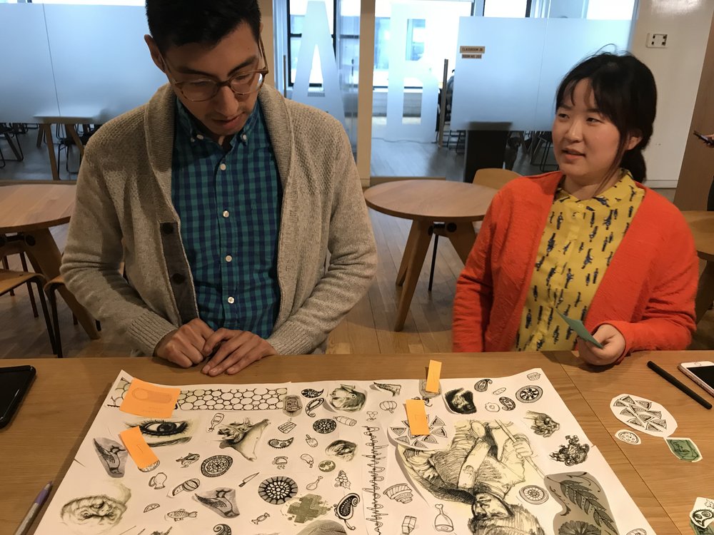
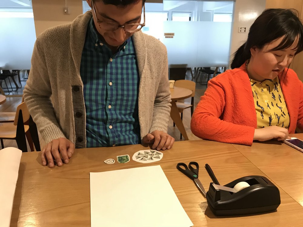
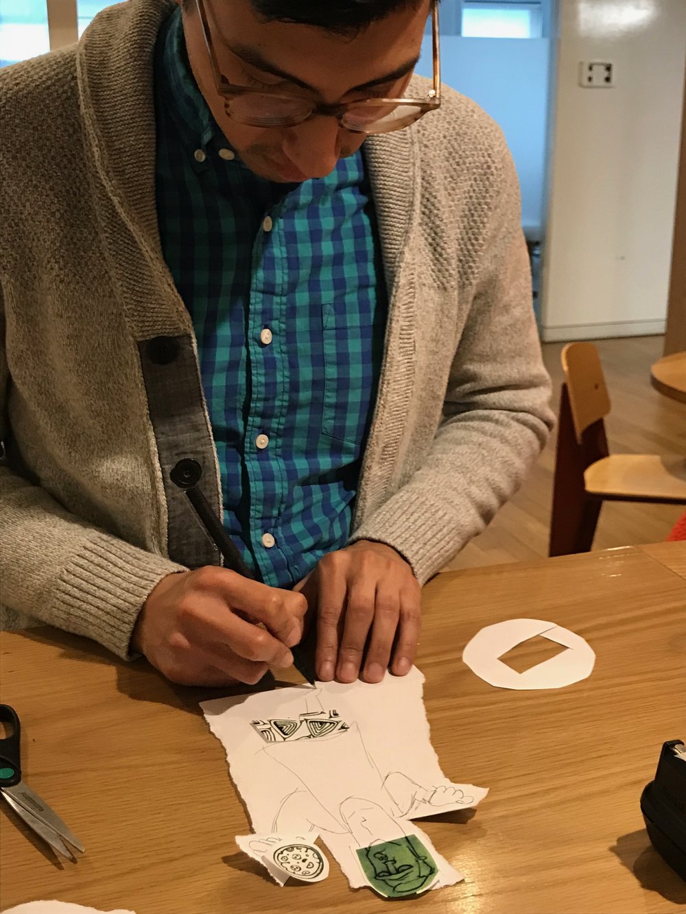
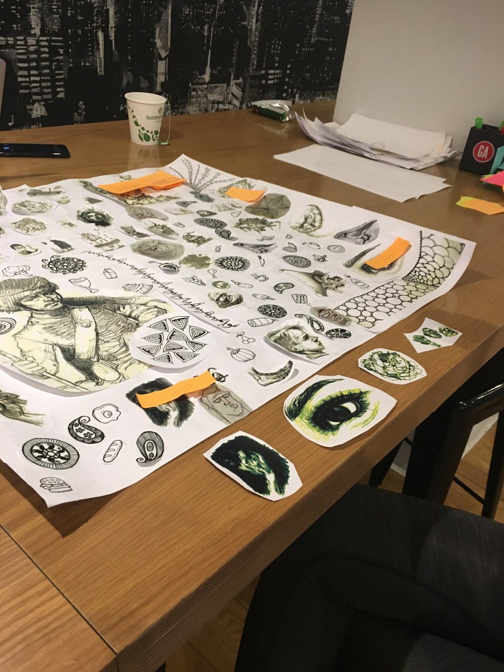
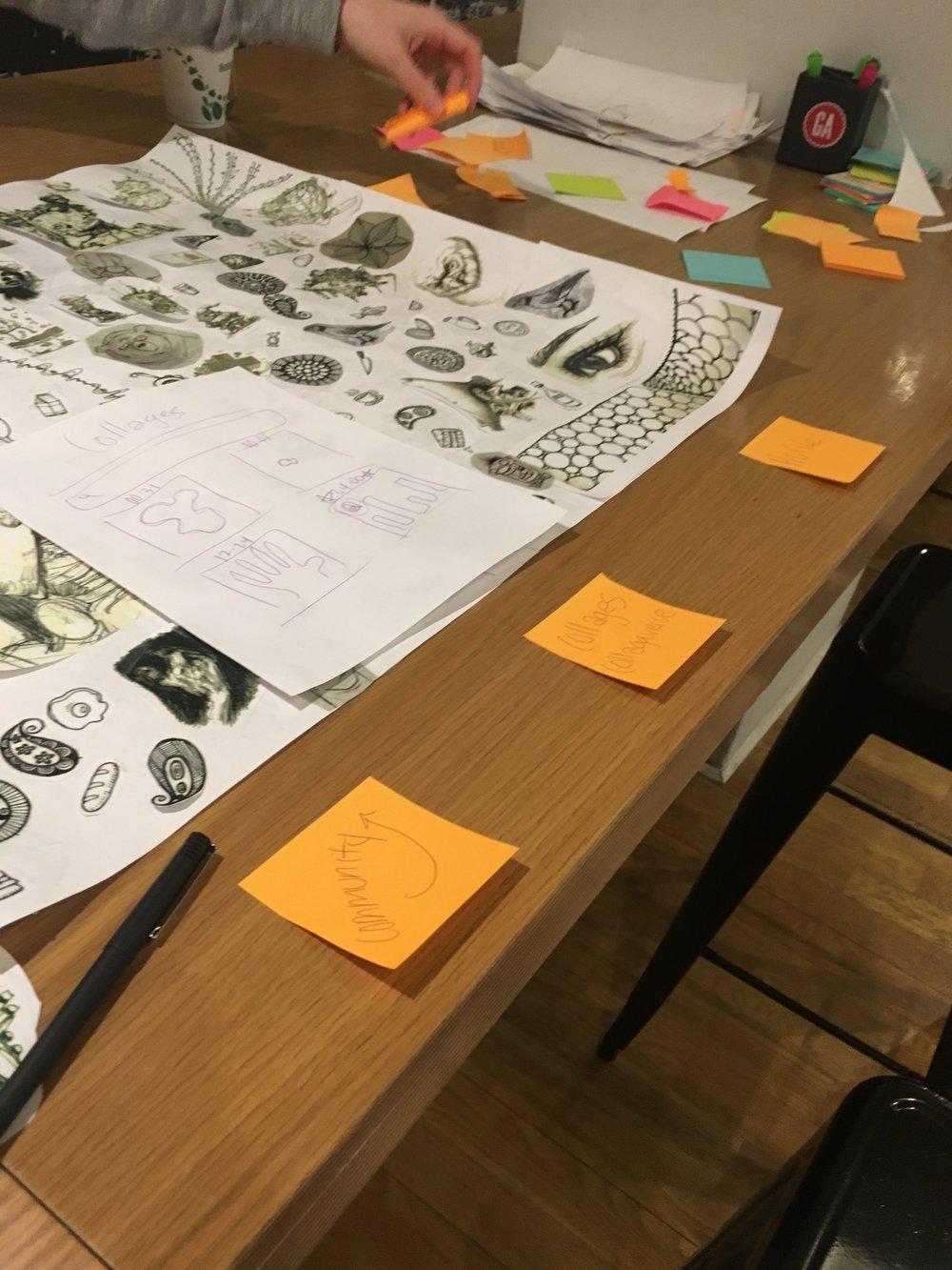
I designed an art workshop in order to test the Creative Confidence Cycle in a real art lesson context with time constraints for each activity. 5 Users participated in creating drawings that became a group palette that all participants could pick from to create a collage. Users then shared these collages with each other and commented on them.
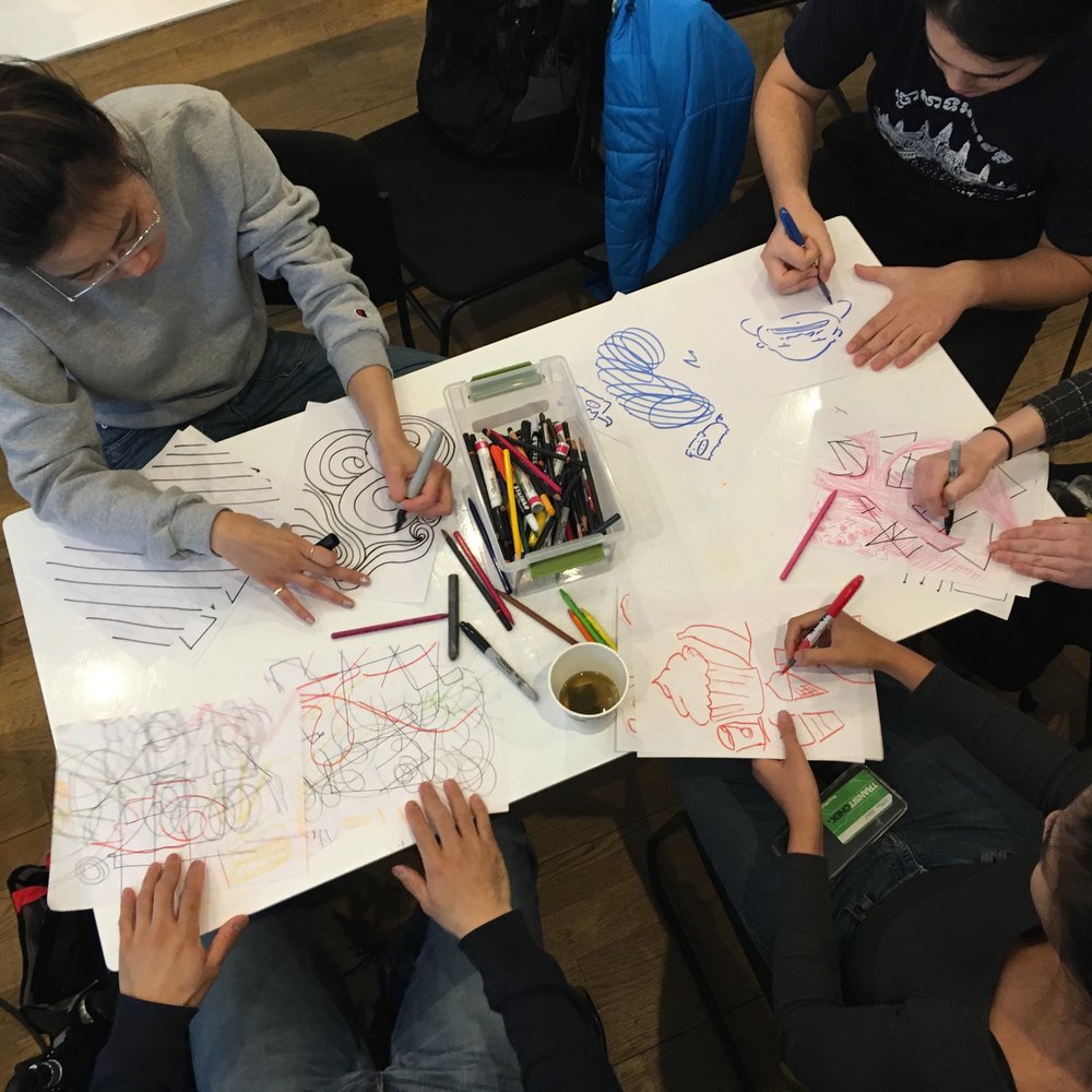
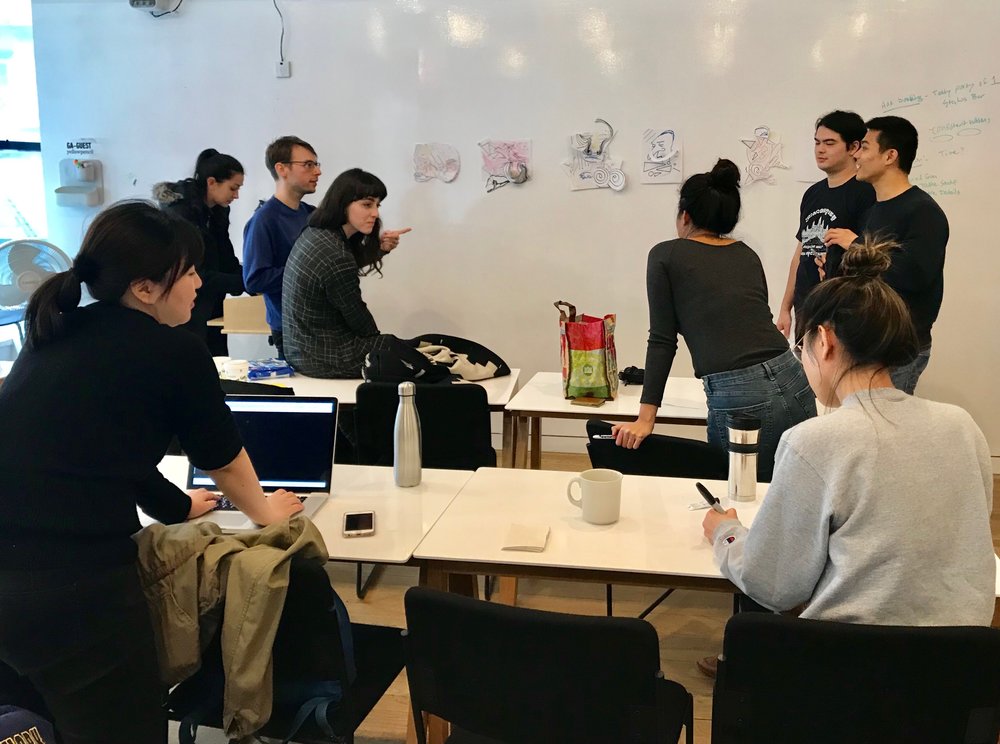
We debriefed participants and validated that:
• A collaborative environment was important
• Constrained time frame allowed for focus on the moment
• Users drew inspiration from their fellow participants
• Interested in learning and doing more
• A tangible result at the end made users happy
Objectives & Key Results (OKRs)
I led the establishment of a team objective and desired results in order to help maintain focus and prioritize design elements moving forward.
Objective
Help people be confident in pursuing their artistic & creative inclinations.
Key Results & their Meaning
1 Recurring use = Investment in their learning
2 Recommendation = Experience to be shared
3 Completing learning cycle = Commitment to the task, clarity of task
4 Engagement/participation through feedback or art = Build a community
Damien, 29
Retail Manager
“I started with just the curiosity of learning, of gaining knowledge through self-exploration….I thought I was going from point A to B, but then realized that there were other things I learned along the way.”

GOALS
- Find an inclusive community of arts learners
- More time to pursue his artistic ideas
- Get positive and constructive feedback
PAIN POINTS
- Art classes don’t fit into his schedule
- Feels unmotivated by his perceived lack of ability
- He doesn’t know where to start or what to learn
NEEDS
- A learning tool that can be accessed anywhere
- Engaging lessons that inspire him to return
- A way to assess his progress
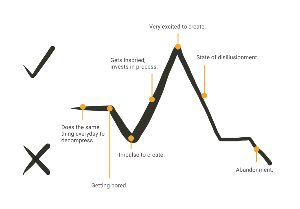
Damien typically decompresses like everyone else watching Netflix, but he tries to push himself by going to art shows when he has the energy and time which inspire him to buy art supplies and makes plans to create art. But his managerial role binds him to administrative duties like managing staff and purchasing which keep him at work late most nights. This leads him to abandoning his plans to use those art supplies, while he awaits another inspiration point.
Damien’s Problem
Damien has creative interests but lacks confidence in his abilities. He is having difficulty accessing structured environments to pursue his interests.
How might we build a digital tool that provides step by step instruction anywhere and builds his creative confidence?
Determining our Design Path
We A/B tested two different flows - Lesson Flow & Collage Flow, to determine which design path we should take for the best solution to Damien’s problem.
Conclusion - We ultimately chose the Lesson Flow based on usability testing results.
Lesson Flow
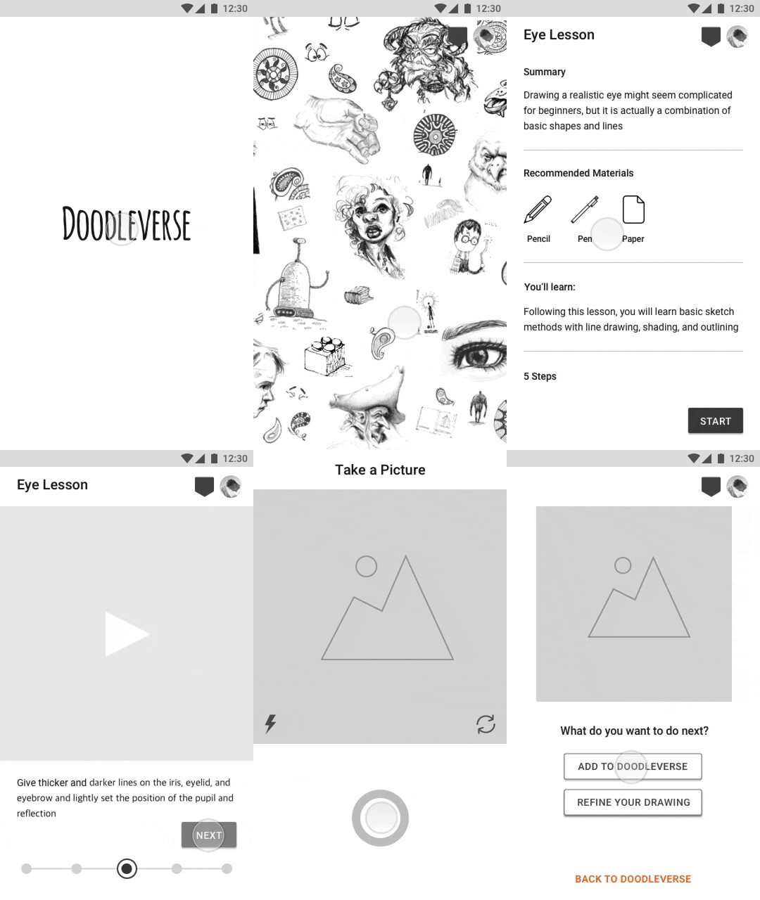
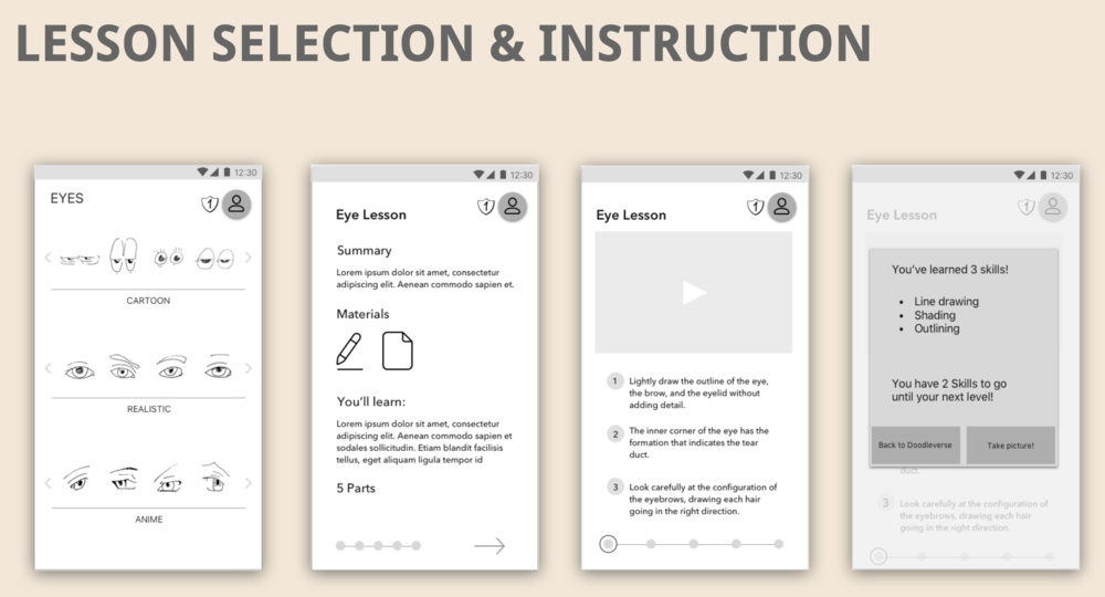
Lesson Flow allows Damien to discover step by step lesson by selecting other user’s drawings from the Doodleverse.
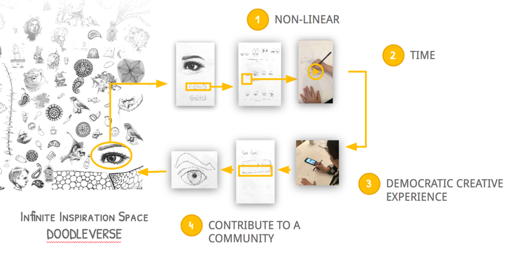
 Video Series of Lesson Content - How to Draw Eye Selected from Doodleverse
Lesson Flow Testing Results
- Ease of use: 3.75 avg (scale of 1 to 5, 5 being best)
- Enjoyability: 5 avg (scale of 1 to 5, 5 being best)
- 4 out of 4 users said completing the task made them want to draw more.
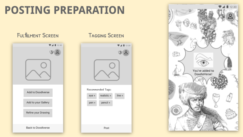
- All users were confused by the “tagging” page –the page before the lesson listing page.
- 3 out of 4 users desired audio to accompany the visual instruction provided in the videos
Collage Flow
Collage Flow is closely related to our Creative Confidence Cycle art workshop. Users create art with other people’s work.
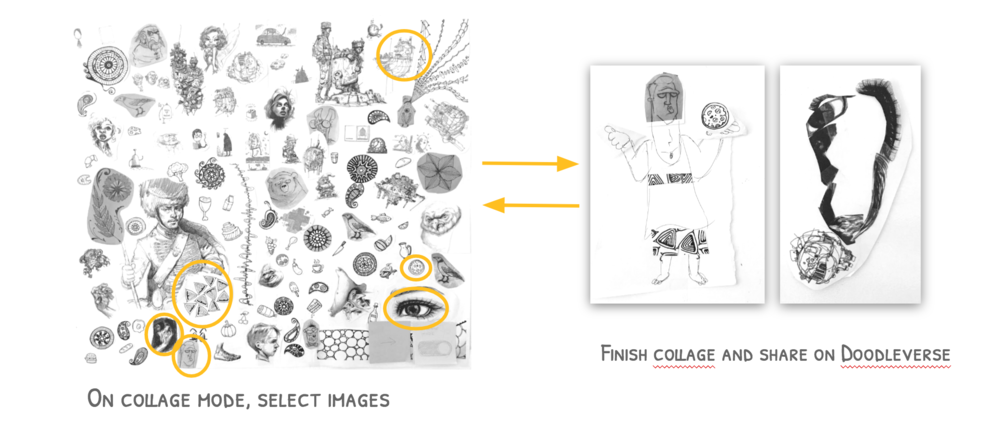
Collage Flow Testing Results
- Ease of use: 3.5 (scale of 1 to 5, 5 being best)
- Enjoyability: 2.75 (scale of 1 to 5, 5 being best)
- Users were confused about how to move on to collage mode from the Doodleverse.
- Doodleverse is just a palette for collage and there should be another space including only collages
- They want to collaborate with other users by combining different collages and make a new one.
The Ideal Path
Focusing on the Lesson Flow, we designed the ideal path for Damien in order for him to be successful in using Doodleverse to help him acheive his goals.
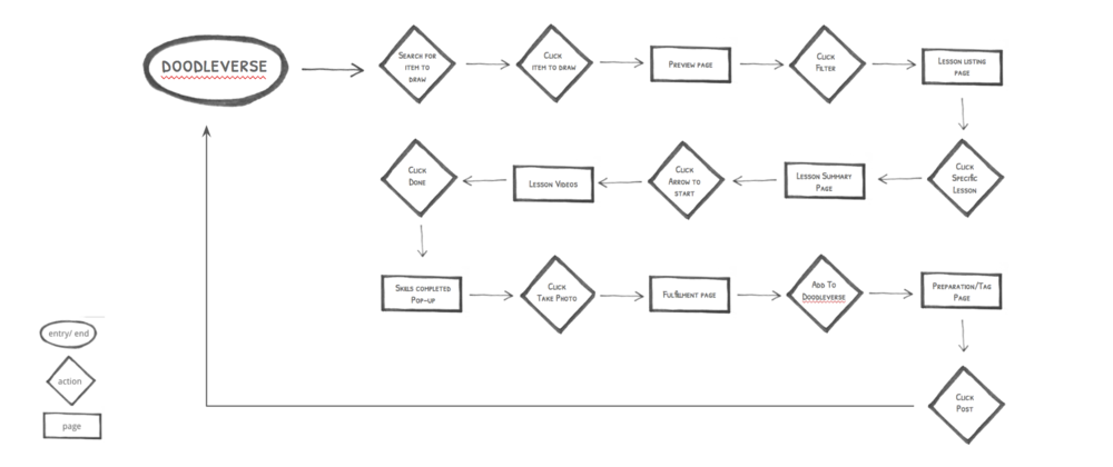
Features Determined
Competive Features Analysis & Design Studio synethesized to define necessary features in our solution.
- Breadth & Scope of Content = Infinite Canvas for Discovery/Exploration
- Clarity in Progression of Learning = Step by Step Videos with Clear Instruction
- Goals & Aspirations = Self Determined Lesson Flow, Feedback from Community
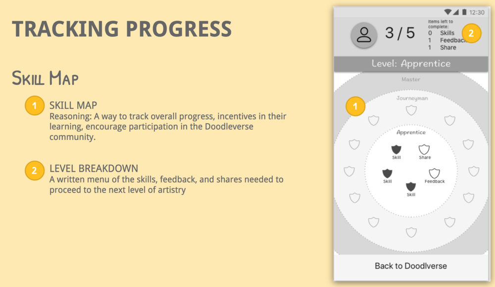
- Incentive for Users = Earning Badges or Skills
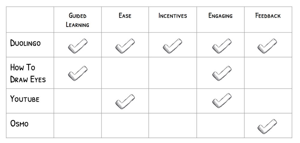 Competitive Features Analysis
Mid-Fidelity Wireframes
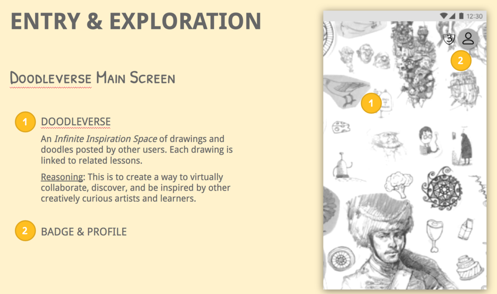
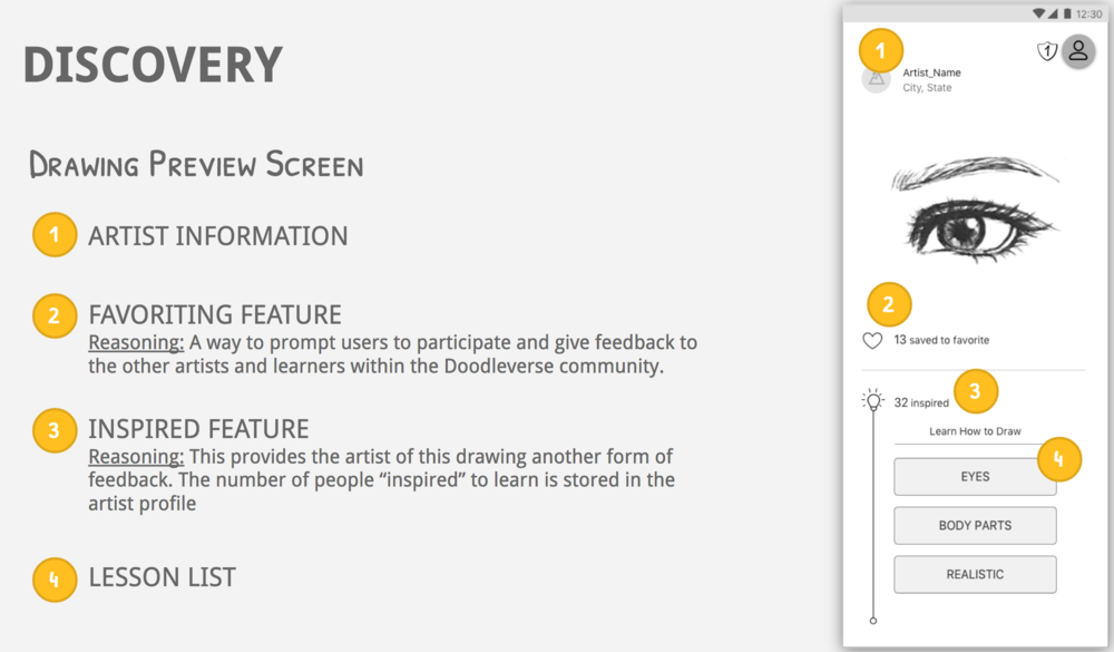
Business Model & Potential Partnerships
Doodleverse is a freemium arts education mobile app with paid premium content, modeled after Duolingo’s services. The app creates a learning environment that encourages creatives to learn, relearn and/or expand their skills. Paid ‘universes’ unlock featured content, focused on specific arts materials and techniques like charcoal drawing, and exclusive lessons created in partnership with commercial entities like Marvel, Disney and Studio Ghibli.
Next Steps Proposed Timeline
1 Week
- Build out User Flow
- Research Analog Arts Pedagogy
2 Months
- Complete ‘Lesson Feature Focused’ Doodleverse App
3 Months
- Future Features
- Collage Mode
6 Months - 1 Year
- Potential Partners Confirmed (2 Nonprofits, 1 Commercial)